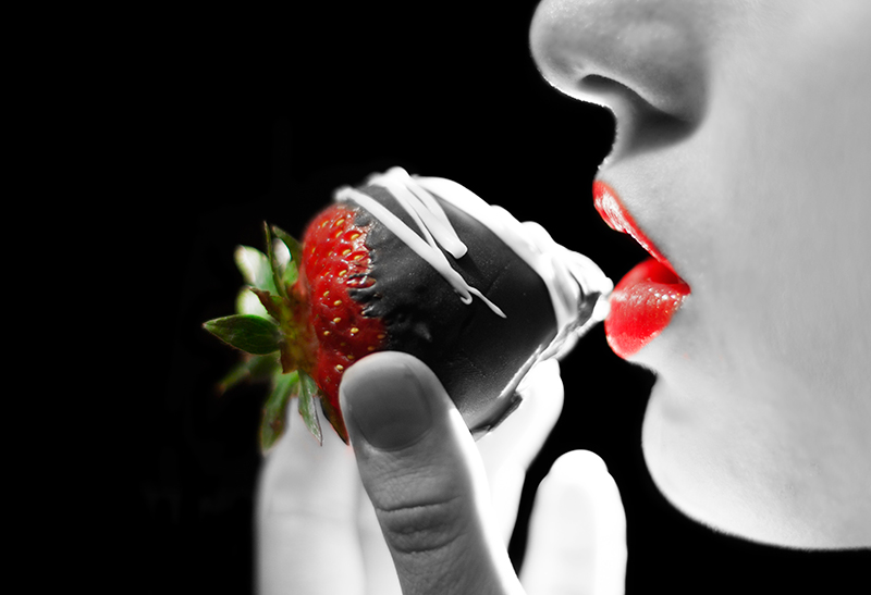
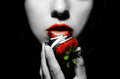
Everyone wants to see the colored version so here it is. I didnt take the time to fully edit it because the B&W hid some of the things the colored photo showed.
Also this is the other photo I thought about entering but got a consnsus from my friends to stick with the current one.
Statistics
Place: 5 out of 51 Avg (all users): 6.7983 Avg (commenters): 7.0417 Avg (participants): 5.7586 Avg (non-participants): 7.1333 Views since voting: 1667 Views during voting: 303 Votes: 119 Comments: 31 Favorites: 2 (view)
Focus and details are good. The vibrant colors of the red strawberry and the red lipstick pops visually off the black nicely. Lighting is a little uneven causing some blown highlights on the fingers in the backdrop, the chin, and a deep 'outline' glow on the finger in the foreground holding the strawberry. I suggest perhaps bouncing the light with a reflector and/or using a faster shutter speed to let less light 'in' on exposure. I can see that you want the focus to be on the red lips and the strawberry but I'm not sure the desat works well in making the dessert look mouthwatering tasty. The chocolate is robbed of the rich brown tones that promises the taste buds sweet pleasure. When paired with the now vibrant color of the red strawberry it appears dull, unappealing and tasteless. I think the visual appeal of the image would be stronger if the chocolate covered strawberry was in full color and the woman & backdrop appear in B&W. That will draw the eye's focus on the main star, the chocolate strawberry, and later the eye will notice the supporting cast of the woman ready to take a taste.
actually now that you mention it, the desat on the whole photo minus the strawberry proabably wouldve been much better. Might have even ribboned with that cuz I can see selective color is very touchy here!
Focus and details are good. The vibrant colors of the red strawberry and the red lipstick pops visually off the black nicely. Lighting is a little uneven causing some blown highlights on the fingers in the backdrop, the chin, and a deep 'outline' glow on the finger in the foreground holding the strawberry. I suggest perhaps bouncing the light with a reflector and/or using a faster shutter speed to let less light 'in' on exposure. I can see that you want the focus to be on the red lips and the strawberry but I'm not sure the desat works well in making the dessert look mouthwatering tasty. The chocolate is robbed of the rich brown tones that promises the taste buds sweet pleasure. When paired with the now vibrant color of the red strawberry it appears dull, unappealing and tasteless. I think the visual appeal of the image would be stronger if the chocolate covered strawberry was in full color and the woman & backdrop appear in B&W. That will draw the eye's focus on the main star, the chocolate strawberry, and later the eye will notice the supporting cast of the woman ready to take a taste.
This is another instance of an image that would benefit from greater depth of field, in my opinion, but it's a really well put together shot, and that deserves a sincere compliment.
This is a tough challenge to vote. I'm torn between "what are you trying to do here" and "what do I expect here". Further complicating matters is the question "what would I do here".
What I would expect would be a technically strong piece of eye-candy that would present the dessert in a way that I would want to at least sample it, if not order it. Along these lines I'm looking at technicals: backgrounds, distracting elements, exposure, sharpness. I'm also looking for creativity, imagination, and originality, which can make up for less than perfect technicals.
So, where does this leave me with your image?
Not a fan of the desat. Also, the lighting is distracting.
I really like the idea of this. The strawberry is nicely done, and the lips are nice. However, the rest is not working quite right for me. I think it's because the grey makes it look a little dead (literally) -- it's such a strange color for a person. I think I would have preferred just a very high key skin tone, slightly desat. This is just a guess, but a living, warm color, but really high key I think would have worked so much better. Plus the back fingers being so blown makes them just glow and stand out.
It's a 6 as it is, but I think this could have been an 8 or 9 shot.
this is a great shot... too bad i think the whole selective color thing is way over used and cheesy... i am sorry i am not trying to be mean, i just think this would have been a killer shot in all color





 Add photograph to your favorites
 Add photographer to your favorites


 Photographer found comment helpful.


