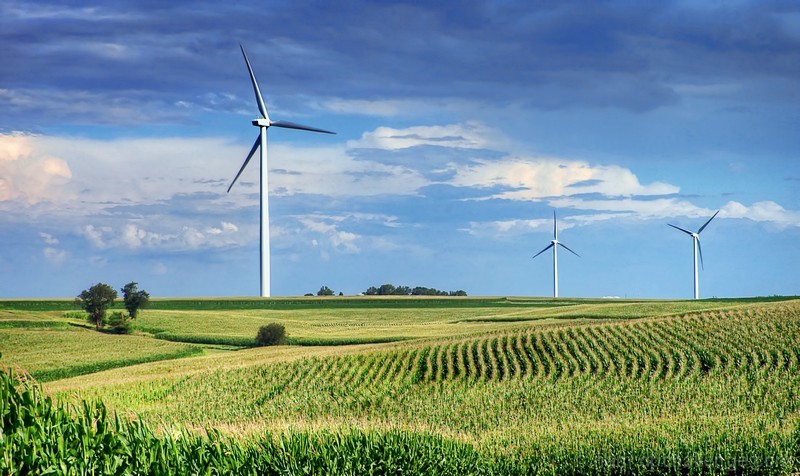
About the same as the other windmill shot. Not great, but a good try.
For me the image lacks richness, the corn just seems to lack depth and feels over processed... *shrug* You probably didn't really do too much editing, it's just that the corn ended up too sharp with a bit too much green, and not quite enough yellow. (the yellow is more of a pale straw color, I know it's probably pretty accurate, but this image could have popped nicely with the yellows cranked up a bit more)






 Add photograph to your favorites
 Add photographer to your favorites

 Photographer found comment helpful.


