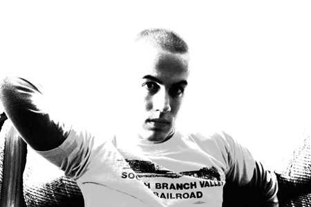
I think this would be better if the background wasn't blown out. It clearly meets the challenge though. And as always, bigger is better if your camera can handle it.
Kind of spooky. It looks like you intentionally blew it out in Photoshop, though. Would have been better if the backlighting had done it for you. The lettering on the shirt is distracting. So is his arm being up (behind his head?).
i think many would say the technical side of this photo is lacking...ie the disappearing arm...washed out head...but it works so well here in my opinion...i really like the directness of the subject...
Cool shot. I like the contrast. I think it would be better against a plain white background without the couch, but it still came out nice like this. Good job.






 Add photograph to your favorites
 Add photographer to your favorites


