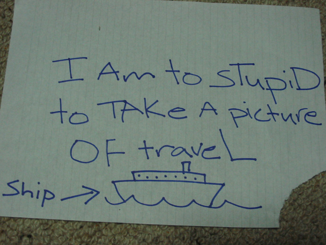
This is a photo contest as much as creativity...I think this picture got too much unnecessary bad press in the forum. Photo wise I give it a 3 you could have cropped better and used a clean, full sheet of paper. on Creativity I really liked the idea and would give it an 8. However as stated in the forum normally works of art including you own is not normally acceptable and I consider this a work of art...However there is no clause as mentioned in the forum so no deduction. The subtotal for the picture is a 5.5 rounded up to a 6. However I am not finished yet. Because the picture was discussed in a forum during voting I feel that is negatively swayed the vote for others so I am giving it a 4 point bonus. Total 10
I find this photo offensive because you are insulting yourself. You do yourself no favors by doing so in a public forum. In terms of technical merit, your composition is different - my eyes keep moving to the torn corner of the paper. Your exposure settings need some work - the paper should be white, not grey. You might want to try experimenting with white balance?
Wish it had been a bit brighter (the lighting, not the wit), but it would have been hard to keep the lines on the paper.
I wonder how many people take the sentence's meaning as written, or as they would if they assume a mis-spelling in the first line...?
ha ha ha ha ha ha I really like the ship it is so well drawn and also the compisition is good because it shows how rough nutz your photography is. It is a real shame that you are truly to dumb to take a picture if travel because judjing by this photo whoever took it has potentioal. I hope you manage to take a real picture next week.
No - the quote should read "I am too stupid to take a picture of travel". Minus an extra point for improper english. (Add it back if this isn't your primary language)
4 Swash (minus 6 for effort, but plus 1 as you made me chuckle for a second ;)
Oh yes, I'm sure you know this too, but dum is really spelled dumb, but you were probably going for another laugh. (I hope)
The horizon of the paper is slanted, the composition leaves too much room at the top, and the lighting leaves the colors muddy and washed out... Other than that, it's very nice :)
The contrasting blue and white is great. I love the simplicity of the ship. Since the corner is torn it's a bit distracting, so I'll have to only give this a 9.
Should I critique this photo or not? Hmm, there is a bit of shadow on the bottom left corner (your head perhaps). There are also a couple of marks on the paper which are slightly distracting. Hmm, were you expecting that?
Then what is the point of submitting at all?
You're obviously not going to win...and I doubt you had any fun taking the photo...So, why make yourself feel bad by getting a low score?






 Add photograph to your favorites
 Add photographer to your favorites


