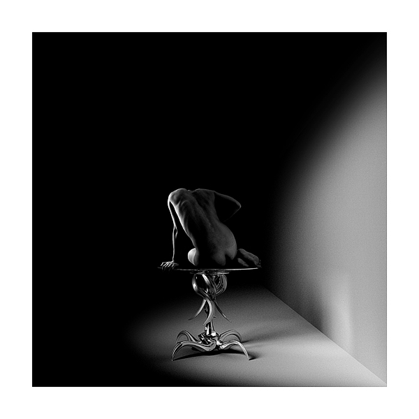
Shades of Dali. It's a stunning photograph. It's a shame it went into the Backlighting contest; while it is a superb and remarkable photo and the lighting is what makes it shine, it doesn't strike me as being backlit. The choice to make the subject such a small part of the photo strikes me as risky, but what a great payoff!
Very nice. It must have taken a lot of control on your part to keep from cropping this. It is magical. The balance of curves between the model and table, the sweep of light, the tonality. One of the best pictures I've seen on this site. I will keep this as a favorite and add to my wish list.
Sorry. I can't seem to be able to add it.
This is a very good shot. The lighting is magical and the setup is unique. The thick white frame is very appropriate. Sometimes, scores given are just too ridiculous. You don't need it to assure that your picture is good. Adding this to my few favorites.
This was by far the best picture in this challenge! One of the best I've seen on this site. Browsed the pictures on that site and they are just great. Those are real photographs... unlike some blue ribbons on this site.
I can't belive that this one didn't get a ribbon, 35th place is just ridiculus! Super shot, super sharp, lighting perfect, composition perfect, I really envy you of this one. Going to my favorites right now. You deserve more than 35th....
Very nice lighting and composition. Wonderful setting and pose. I only had two problems in viewing: 1) the table base had such clarity and reflectiveness that it tended to overpower the image of the body; and, 2) given the lighting on the subject, the shadows appeared very indistinct and far toward the background than what I would have expected. As a result, I ended up puzzling over the "whys" rather than enjoying the image as much as I would have expected. But, again, a VERY nice image. Congratulations.
not what i qould consider true backlighting, but it's wonderful! I wish the table was centered a little better on the half circle of light on the floor, and the body was centered in the middle of the photo, but that's just one persons opinion!
great shot, I hope you do well!
Very cool table! This is an interesting image... It's kind of neat looking without the models head in the shot, but I also wonder how it would look with the models head.. Very interesting... Good job.
I'm a dark monitor sufferer but here goes. As displayed on my (dark) monitor) I love this picture, you should see it ;) I downloaded it a lightened it somewhat and still thought it was great but prefered 'my version'. If I'm picky I'd say it was more side lighting but (as with most submissions) this has not really swayed my vote. I love the dark space and positioning of the model, my only critism would be, well I can't really think of one and feel this wpuold be great as a print on anybody's wall.
This is a beautiful image. Absolutely beautiful. I don't think it meets the backlight challenge though since it isn't backlighting. The lighting is more directional. I believe that it is much harder to keep correct exposure when you have light that is shining in front (this subjects front..)of the subject. Since the lighting is off to the side, it is quite easy to keep the subject properly exposed.
Beauitiful use of light. Very sculptural. I like the contrast of the curves of the body and of the table against the hard lines of the environment. Setting the line between floor and wall into the corner of the frame works so well. Composition very strong.
That table is really neat to look at. I like the image. The composition is nice. Not to be a nit picker, but it does sort of bug me that the challenge is backlight and the light in this image seems to all come from the side. This did not change my scoring by any means because I still think it is a great shot.
Now when they said "backlighting"... :-) Seriously, this is a well conceived and executed photo with excellent lighting. My personal preference would be to make the subject larger and move it to the top left of the frame (essentially cropping out most of the black), but the way you've done it has a lot of interesting qualities as well. Nice job!
Like the shapes, the curves, the contrasting sharp straight line, the semicircular shading, the balance. Could have done without the big white border, it detracts.
Wow, this would make a great large scale print... Techincally rim lighting, not backlighting, but heck, this is not the sort of thing I expected to see for this challenge. A 9 for me...
This is a very pretty image, but does not really portray back lit to me. It seems lit from the side, and there could be more light on the back itself. I really like this picture, but it just doesn't say backlit to me. Maybe I'm being too literal.





 Add photograph to your favorites
 Add photographer to your favorites


