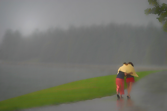
this is cool use of blurring, and the colors are great.
i might have taken the blur tool, and run it across the center area of the grass/sidewalk edge - where it is sharp still - to give an overall smoothness to the image - it's blurred nicely at the top and bottom of the frame. that might also draw the eye more toward the people as well...
conceptually, this is a very intriguing, powerful and striking image. it is also beautifully composed. i still think the only think that lets it down is the flash of green bank across the centre. if this was perhaps greyscaled, or cloned with the flat grey of the footpath, then i think it would appear slightly more balanced, with the people (and their bright splashes of colour) a bit more prominent.
since reading your description as to how it was done, i've tried the same with (even if i say so myself) pretty successful results - turning seemingly dull and lifeless shots into something substantially more gratifying. so thank you for that.
again, this is a spectacular and original and gorgeous shot. 160th out of 189 is truly an injustice, and evidence of the number of deranged twonks that plague the voting here... 13 ones. i mean, honestly. i gave this a ten; and if someone told me i could only have five favourites from the whole site, this would easily be one of them. it's inspiring stuff like this that makes the 25 bucks a year such a bargain.
In response to comments requesting post-processing details:
I used the clone stamp and smudge tools to remove a partial halo of a steering wheel in the very bottom right of the image (the photo was taken during a downpour from inside a car).
Minute adjustments were made to contrast/brightness (levels) and hues. I used a lighting effect to emphasize the presence of light in the sky (above horizon/top left) and applied smart blur to the entire image. Sharpened (via USM) and resized, as usual.
The effect so many of you questioned is due to the smart blur filter entirely.
Whether or not this shot has 'photographic integrity', I cannot say, because I don't know what the term, specifically, means. To me, the 'effect' suits this particular photograph, since the 'irreality' proliferated by it
replicates the one inherent in the actual scene (confusion of sharpness and unsharpness of objects perceived during a torrent / play of light under such conditions).
I, decidedly, do not view this image as 'digital art' (with all its aesthetical connotations), but wish, instead, I could have found a way to render the photo less inclusively sharpened, as I have done and as wagnes has so aptly pointed out.
This is a beautiful work of art! I like it a lot. The on-going debate over what makes a great photograph, The composition or the technical aspects of the photo? I know from experience you need to start out with a very well taken photograph. I'm giving this a 8. Placement is excellent and the overall feel of the work tells a story. I think you may have taken the abstract effect just a little too far even for my taste. (Keeping in mind, this is a photography contest so the voters might not give this the credit I feel it deserves). This is an awesome and bold entry for DPC.
This is a very effective use of this treatment. I do think it's fairly inappropriate for this challenge since travel guides don't typically use this effect, but I have seen stuff like it in travel brochures. It is taking leave of photographic integrity somewhat, but if you're going to use the effect then this is a very good way to implement it.
You've probably got a very decent photo under the FX, so I'll add my voice to the doubtless many comments asking to see the original. I love the women's pose and the composition is superb. I bet this scores well despite the treatment as it is quite compelling.
Actually, I've never voted an artificially treated shot so highly.
I really do like the look of this photo...but, it has lost its photographic integrity, to me. My eye is definitely drawn to the people and them trying to escape the rain.
Feels way over processed. I notice it has been validated, so I'm sure it's legal but the feeling of being over processed is a distraction. Great as a poster. Not great as a photo.
I would have given it a 10 because it is so gorgeous--very simple but evocative. However the edge of the grass on the side facing the girls seems to be too sharply cut off--it looks artificially tweaked. This might be what you were going for though. It is good.
okay, i won't hide the fact that i normally hate this sort of thing, i've never been able to see the point of why software such as PSP and PS even includes such gimmickly things for surely they have no real artistic use. then you go ahead an do this - it's brilliant! the slash of green does look a little strange, can't quite explain why (shape? angle? not sure) but that aside i think this works brilliantly. it's more painting than photo, and will probably get knocked down a few places from what i think it warrants as a result. but i think it's superb, and has inspired me to have another play with those filters i thought 20 minutes ago were stupid. fantastic - 10.
There's an awful lot to really like here - a fabulous image. Is it drawn? It seems as though it could have been, or of course it could be a heavily mangled photograph. Outwith the intentions of dpc though, but nevertheless a great picture.
Picture has moved from the realm of photography. Too little detail in the photo. I know it is what you were trying for, but the biggest detractor is that yellow shape over their shoulders, I spend too much time thinking it is a big kite that has landed on them. Or maybe some kind of Pterodactyl.
Very cool image, but way overprocessed for the requirements of the challenge. Looks more like a painting in a gallery (and a good one at that) rather than a photograph. I would also have cloned out that branch in the upper right corner. Can you please let me know what process was used to achieve this result once the challenge over? Thanks.
I like what you've done here - too ps for some but I enjoy your turning a photo into a watercolor painting. I just don't see this as connected to the theme as it would have been as a photo -- sorry.
Too processed in my opinion although the composition of the two people walking along a path with the fog is a great shot. Unfortunately, it looks nothing like this in real life.




 Add photograph to your favorites
 Add photographer to your favorites

 Photographer found comment helpful.


