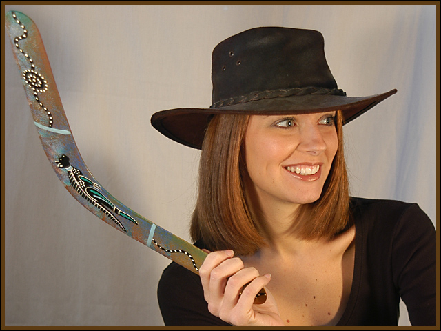
This is Amber Brkich of "Survivor: Australia." I'm curious to see whether people will mark this down since I used her as the subject of the concurrent "Black & White Portraiture" member challenge (different pose, same shoot). We'll see! I thought this would be a fun submission for the travel challenge.
Statistics
Place: 55 out of 131 Avg (all users): 5.3897 Avg (commenters): 6.8333 Avg (participants): 5.2346 Avg (non-participants): 5.5000 Views since voting: 2136 Votes: 195 Comments: 14 Favorites: 0
Composition
I find that overall the composition of this works well. It fills the frame nicely (maybe a touch too tight, even), and the boomerang helps to serve to pull the eyes down and in. Her location in the frame is good, an effective use of the rule of thirds. My only complaint is that her pose looks a little stiff. Maybe changing the pose so that it looked like she was just holding the boomerang and not pretending to throw it.
Technique
It is very well focused, and the lighting works well in that it is bright and "illuminates" her features well. However, the brightness of it bothers me somehow because of the plain backdrop. The lighting says, "Outside, sunlight" while the backdrop says "Indoor, studio." Does that make sense? If not, contact me, and I will try to explain further. It would have been awesome if she could have been standing in front of an outback looking scene (but I understand that there are some things that are not possible), or at least out side somewhere.
Overall Effect
I live under a rock and have never watched this show, so I didn't know if it was an actual contestant or not. That is cool that it was. I don't think it hurt you to have her in both challenges, I think it was a good idea. Though I thought it met the challenge, I wonder if some of the lower voters questioned it. It does seem to show more the result of travel than actually travelling, and though that works for me, there are some for whom it doesn't!
Here's that cute again ... same model as the other challenge. But guess what, I'll give you a 9 because she so cute and the picture really depicts Australia to me. Good job. Jacko.
I like the lighting & exposure and color of this image. It would do great in a travel magazine when the background was a bit more interesting.
Good detail.
8
Technically a very well done picture, but not sure I like the pose of the model as it reminds me of a department store advertisement and I see the picrure having more to do with that than travel. Also the foreground is kind of boring.







 Add photograph to your favorites
 Add photographer to your favorites

 Photographer found comment helpful.


