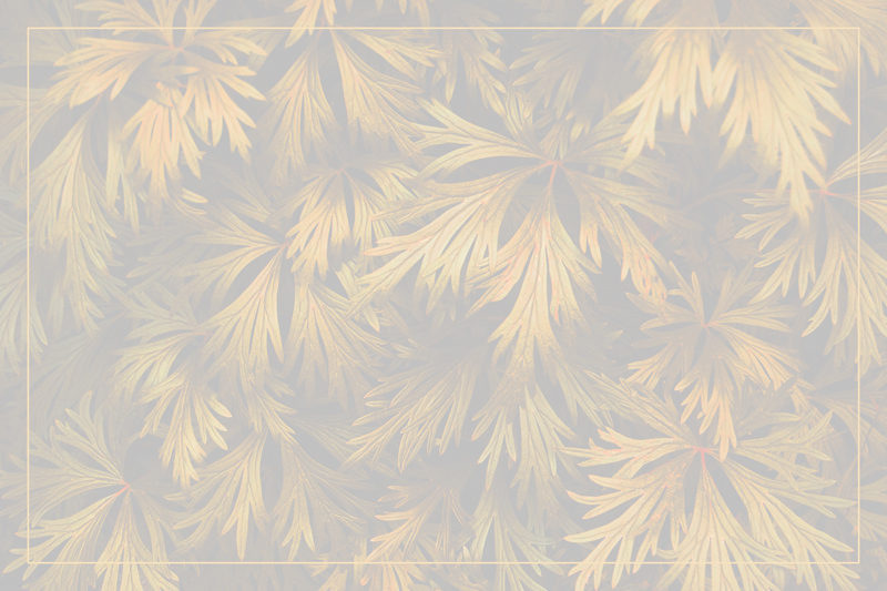
Went slightly overboard with the editing on this one... was just tired of green, green, green. Oooh, I bet people will hate the brightness.
Convert from RAW, crop, sharpen, adjust colours, levels, increase saturation, increase brightness a bunch, added a frame (just because I wanted to try it at least once!), and save for web.
Statistics
Place: 104 out of 124 Avg (all users): 4.9238 Avg (commenters): 5.2500 Avg (participants): 4.8182 Avg (non-participants): 5.0400 Views since voting: 358 Views during voting: 195 Votes: 105 Comments: 5 Favorites: 0
I think this would have been top 10 if you you hadn't reduced the contrast so much. I gave you an 8 anyway because it is a really lovely pattern and I like the burnished gold tones - if only they were brought out some more.
WOW this is truely different, you took a large chance with this and my opinion is YOU HIT IT CLEAR OUTTA THE BALL FIELD!!! I hope others love this as much as I do!!! I bow to your origionality!!
A wonderful abstract, but ruined by the choice not to use the whole light-dark spectrum. I enjoy images that rebel, but this one just takes away in my opinion. I'd love to see this processed to fill the whole histogram.





 Add photograph to your favorites
 Add photographer to your favorites

 Photographer found comment helpful.


