INITIAL RESPONSE: Good composition, nice colors, look overexposed
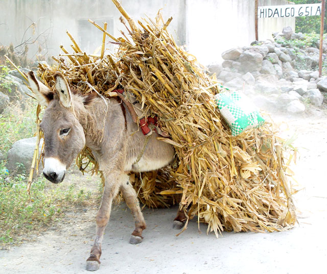
COMPOSITION-CONTENT - The composition and the content seems very good to me. But even to suggest to say with a heavy sun I think the background is too bright (The donkey by itself is fine).
The wall looks pure white and we're missing details and coors on the cushion.
I think you brought the right items for this composition .
I like a lot the story it tells and the animal is in a nice osition.
Color would be deeper as well (except if it does not convey what you wanted to convey). I would definitly try some leevl adjustement.
BACKGROUND : Significant in the 'story telling' part of the picture. too bright really even if that way it detach the donkey more.
CAMERA WORK-TECHNICAL- See above. I think the exposure (if you do not have any processing) is too high. The wall in the background seems all pure white pixels without details.
DIGITAL PROCESSING - TECHNICAL - Could afford some processing to adjust the levels.
MY OPINION ON THE PHOTO - I like the shot but I am really distracted and bothered by the overexposed part of the picture. The story and the very good framing still make it a nice picture.
At first glance one would say this photo is too light or washed out. But when you see the donkey and the fodder you know it isn't. Looks like the cushion you sit on is sliding off the donkey's back. You did a wonderful job of catching him in mid-step and getting everything in focus. Great photo. 9 PTL
Funny subject. Nice composition, good color.
Seems to be overexposed at the right and in the background. Perhaps that could be avoided? Too bad a tighter crop would go throug the sign.
Nice picture with the colours of the donkey contrasting with the dust filled background. The image is a good comment to the theme of the gallery, being composed of the meeting between two travellers: the beast of burden and the photographer.
Being an animal lover, my first instict was to say, "Poor thing!". However looking at the photo, it is a great shot! Perfect timing to get the sign in the photo as well! 9 Strong1Blind
Love this!! Lighting is a bit harsh, especially on the right of the picture, could have been toned down a bit. Maybe a closer crop of the donkey would have been good





 Add photograph to your favorites
 Add photographer to your favorites

 Photographer found comment helpful.


