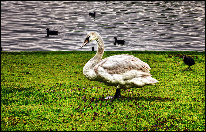
A little too sharpened for my taste, making it uncomfortable for the eye to settle. The composition is somewhat static - I wonder if a little less centred and more space for the swan to look in to might help? The placement of the three ducks around the swans head is serendipitous!
Interesting choice of processing. Not to my tastes personally as to me, this seems overprocessed, but to each their own. With a retro/grunge border I can see this on an arty greeting card.





 Add photograph to your favorites
 Add photographer to your favorites


 Photographer found comment helpful.


