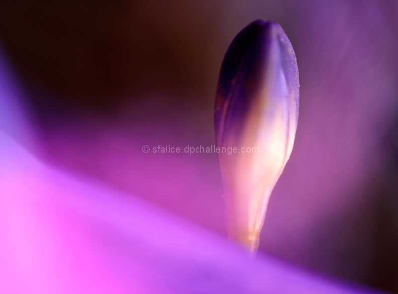
It has a beautiful glow and tonality to it.
Perhaps one of those images that gets overlooks in its simplicity and in quick voting. I would also wonder how it would score if the main "bud?" was sharper overall in comparison to the foreground / background.
I can only blame it on voters not really taking their time on images, and some images needing time. It is said and a traditional impressionist painting needs at least 2 minutes to "foment" thought. Perhaps your image is of that requirement. I know that when I go to museums I rarely can stay for 30 seconds in front of an image- or maybe a long gaze at a handful- not all. So the first impression is key, and here, your image has beautiful shapes and color, composition of light and dark- perhaps all those things that make it great are the qualities that border on abstract, and I find that abstract images in non-abstract challenges place lower. Or maybe some voters don't like purple and purple tones-or maybe it is a smashing image but voters can't make out pleasing foreground blur from background blur, or perhaps a purple mist.
I have analyzed it to death, and I fear, not too expertly. It was a beautiful image, with shape form and color- even grain and light, adding to the sublime aesthetic of the shot. What the hell do the voters know anyway?
The scores overall for the challenge appear low (many folks expected to see the little circles of light), so I would take it with a grain of salt. You delivered a very pretty image that meets my expectation of the challenge, so congrats!






 Add photograph to your favorites
 Add photographer to your favorites

 Photographer found comment helpful.


