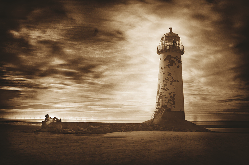
Started off with what looked like apparently selective colour, blue sky (apparently badly selected) which would actually have been legal in basic editing. This was shot with white balance set to the sand, then mucked around with in channel mixer, no selections made whatsoever. However i didn't really like how that looked, and ended up hue-based desaturating everything BUT the blue, then simulating a yellow filter by taking just the blue channel. Then some dodging and burning to emphasise the already very contrasty sky and that whole drama and bring out the vignette some more. Finally a conversion to duotone going for a sepia effect - in fact tritone - with laboriously played about with curves, the spot colours i chose were gold and orange - 165CV and 157CV. The idea is to emphasise the sandy feel of the image.
Alternate titles were to do with "three very different travellers" or vague waffle about different sorts of footprints in the sand, but it was all a bit too existential and the title began to turn into an essay, so i tried to keep it short.
The less-obvious third traveller, the shadow to the right of the lighthouse, is in fact a bystander who wandered into the shot - being too late to stop him, i thought he might create an interesting effect. A more interesting effect if i left him alone, than if i'd tried to remove him from the scene at the time, which would probably have just resulted in an indignant-looking shadow instead of a neutral-postured one.
The guy on top of the lighthouse is made of metal.
The girl on the left is not, and was in a great deal of discomfort for four minutes.
Statistics
Place: 11 out of 72 Avg (all users): 6.3587 Avg (commenters): 7.7143 Avg (participants): 6.3529 Avg (non-participants): 6.3621 Views since voting: 1273 Views during voting: 198 Votes: 92 Comments: 9 Favorites: 0





 Add photograph to your favorites
 Add photographer to your favorites

 Photographer found comment helpful.


