Thanx ambaker an all other for you comment and critique.
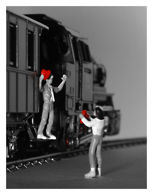
Setting the light was for sure the hardest problem of the picture and could have done better. The train itself is illuminated by the light reflected from the white cardboard that makes the background. The figures are illuminated by a single spot-light from behind the camera. This light leads to the reflection on the lower left tracks. Couldn't get it away, otherwise the man would be in the shadow.
That the light is so harsh on the figures is not only the result of the light itself (I need better controllable light sources) but also from the too strong unsharpen-mask I used.
DOF is really a big problem for me. Although I like my camera for it's image quality and features given for about 300 Euro, the two aperture settings (I used the highest f-number 11) don't really vary the DOF. At the moment this lack of aperture control would be the major reason to switch to an different camera.
But of course, this has been real macro: the figures are 20 mm in height and I had to use a +4 lens to make this picture. DOF is simply to low with the added lens.
I like the overall effect. However, I think you might benefit from playing with the angle of the lighting. The sharp reflection of the ties along the rail, at the bottom left of the picture, tend to intrude on the scene. They almost look like little daggers. Since this is macro, there is only so much depth of field to be had. Still the front of the train tends to blend into the gray backgound. Could you have gone to a smaller (higher number) f stop to get a little more depth? Or once again, different lighting? Or on second thought, a larger f stop to make them a little more isolated in the scene, by softening the foreground as well?
As the effect was achieved by desaturating everything but the red, there is a bit of a red reflection or cast at the wheel of the engine where the driving arm attaches, that catches the eye. Lighting angles and placement of figures could work here too. I guess the biggest thing I see here, can be traced back to lighting. It is so bright aimed at the figures. Almost too harsh for my taste.
I do like the overall scene. The engine is suitably large and powerful, signaling a journey that cannot be denied. The mood is such that it seems more than just a journey around the table-top. The placement of the figures is well done, they seem to be communicating rather than just placed haphazardly around the scene. They do not appear to be poseable figures, yet you did a good job making it look like she is really talking to him.






 Add photograph to your favorites
 Add photographer to your favorites


 Photographer found comment helpful.


