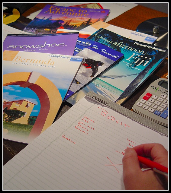
Challenge:Travel (Classic Editing) Camera:Sony DSC-F717 Location: My Brother in law's desk Date: Dec 28, 2002 Aperture: F 2.1 ISO: 100 Shutter: 1/100 Date Uploaded: Dec 28, 2002
Hi Douglas, your photo was assigned to me in context of the Critique Club. So here it goes:
Composition: I don't like the cluttered look. There are way too many objects in the background, which distract from your actual idea shown in the foreground.
Lighting: The lighting also does not support your idea. The colours in the background come out first. Also the lighting on the Bermuda catalogue is much brighter than the one of the foreground and thus attracting the eye more. I think a spot light on the red cross would make the scene more interesing.
Focus: Same here. The hand is not in focus but as a viewer I somehow expect it in focus because obiously that's where the "action" takes place.
Digital processing: The border is nice.
Art: Honestly said, I personally don't like the photo. It's a nice idea and also meets the challenge, but it's not more than a quick laugh and then you forget about it. Sorry.
Good idea, and probably close to real life. For me it's too cluttered. In my opinion by the time you are down to the budget part you at least have picked a theme, ie snow, beach, mountains, etc. and are comparing those prices. This would eliminate the clutter by cutting down on the number of brochures. Making sense? Also the hand appears to be out of focus. But it is still a decent shot worth a 6. PTL





 Add photograph to your favorites
 Add photographer to your favorites


 Photographer found comment helpful.


