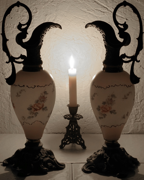
This is a lovely image, but I think it would serve the challenge criteria better if there were more difference between the pitchers (which I take to be your foreground) and the candle. You have depth, but I don't really see foreground/background here. It would also be better, I think, if there were a bit more space around the outside edges, particularly the sides. With so much lovely space around the flame, the handles really look like they're squeezing in to get in the shot. You might also consider getting a piece of fabric to function as a flooring, as the seams are very out of place and distracting among your lovely swirling forms and textures.
This is very pretty, and I like the symmetry of the composition. The colour feels slightly flat, though.. it lacks warmth; it might benefit from conversion to a duotone, or a tiny bit of levels tweaking - of course, that might also throw away the detail of the candle. At any rate, it's a unique photo that meets the challange fairly well.





 Add photograph to your favorites
 Add photographer to your favorites


 Photographer found comment helpful.


