Critique Club
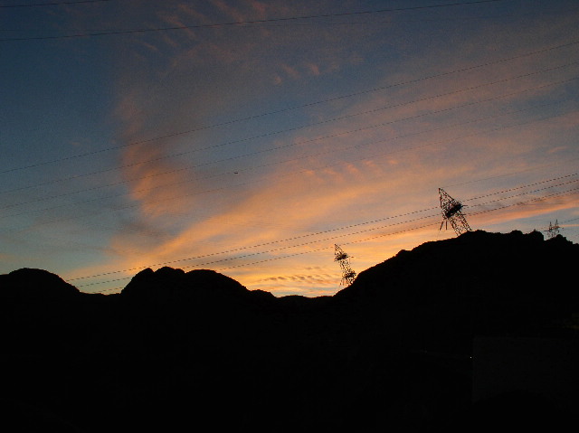
By levelling out the horizion, you created diagonal lines all across the picture, with the power line towers leaning over at a threatening angle. The eye keeps getting drawn to the towers, expecting them to fall.
The strength here is the colors of the sunset and the mountains etching the sky. I don't know if it would have been possible to escape the power lines for a clearer picture, but that would be one idea. If the power lines were intended to be the subject, I think it would really have worked better with vertical towers and less sharpening.
The sky colors are great, the silhouette of the mountains makes a nice dark frame and sharp cut across the sky.
Focus is good, contrast is good. Your exposure is right on the mark. Any darker and the sky would be too dark. Any brighter and you would lose detail in the clouds as well as making the mountains a muddy brown instead of a nice sharp black. There is a lot of potential here.
-alex |







 Add photograph to your favorites
 Add photographer to your favorites


