I like it because of the blown highlights. The more I looked, the more I realized that I like the photos with the harsh contrasts better than the more subtle contrasts.
Though now I realize that I was looking at a bad reproduction, and that AA's original doesn't have the blown highlights. Ah well...
There's not much around my area that fits Ansel Adams type photos. I liked the stump, but I didn't like that it was straight on. It would have been much more interesting at an angle, but the background didn't work from any other vantage point.
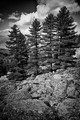
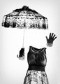
Here are some other options:
Statistics
Place: 29 out of 97 Avg (all users): 6.0841 Avg (commenters): 5.3333 Avg (participants): 6.0465 Avg (non-participants): 6.1094 Views since voting: 770 Views during voting: 262 Votes: 107 Comments: 8 Favorites: 0
Holy crap - that was yours? Seriously, Wendy - I think you are my new photo god. Every time I pick my top 3, you are RIGHT there when the challenge results pop up. I just loved this. It was a 10 for me, but I didn't vote.... I didn't feel like I understood the challenge/Ansel enough to pass judgement on everyone's interpretation.
The subject is excellent for the challenge, but for me the image falls short in composition (the almost 50-50 horizontal balance feels static), tonal range (highlights are blown), and focus (sky is too soft). Voted earlier
I am not voting because I have no frame of reference for the challenge, but i AM looking....and I freaking LOVE this. the soft whispiness of the clouds - the stark contrast to the wood - I really just adore this.
Interesting, good sky. Detail is lost in the bright areas on the water. The driftwood stump seems a bit awkwardly placed in the scene. It blocks, rather than complements the view. While I'm sure you wanted to include as much sky as possible, the vertical orientation (with frame added, besides) seems an awkward choice. I do like the good detail in the foreground sand/mud.







 Add photograph to your favorites
 Add photographer to your favorites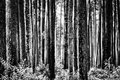



 Photographer found comment helpful.


