|
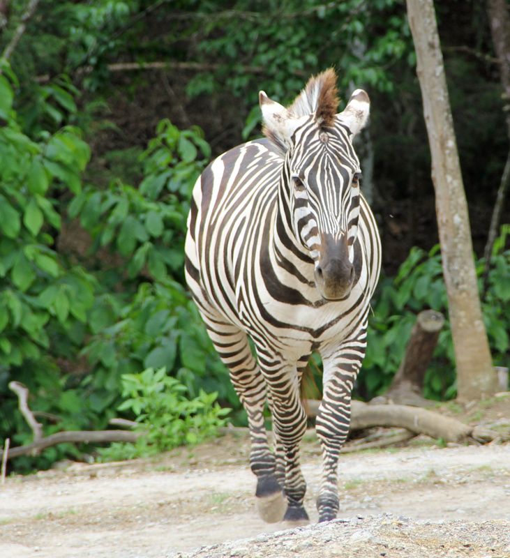
You said you would like comments on entries, not necessarily this one but on entries, so I came over to see what you have that I voted on. Gave this one a 6. I thought it fit the challenge very well and was nicely focused. Head on is tough but you pulled it off and again it works particularly well for "symmetry". I think this one could have scored quite a bit better with a few post-processing tweaks. I would have liked to see blacker blacks (especially) and whiter whites in the zebra - maybe a little dodge and burn (esp). The image feels crooked. I would rotate clockwise. You might also try this in black and white - zebra images work particularly well that way and the green wouldn't overpower the subject if you did. Just some ideas I would try - I think you have a very nice photo here. |





 Add photograph to your favorites
 Add photographer to your favorites

 Photographer found comment helpful.