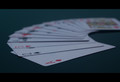
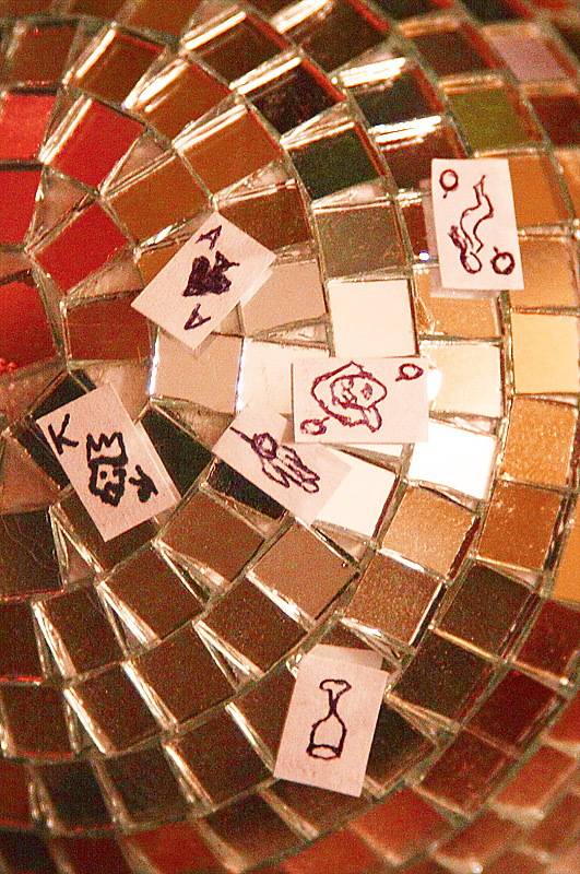
Hmmm...the main problem for me here is less the concept and more the execution. The high ISO is super-visible and where the mirror ball catches the light directly, it lools like a blank card. The drawings on the cards are a good idea though I honestly don't know where the hanged figure fits in...the joker, maybe? :-)
Very nice idea that could be further developed. I feel that it was done too hastily - so was the shuffle.
I like its freshness though and am delighted to see these cards.
bump
Very nice idea that could be further developed. I feel that it was done too hastily - so was the shuffle.
I like its freshness though and am delighted to see these cards.
bump
I enjoy the effort put forth, very nice drawings for a scale so tiny. It would've been easier to print off some tiny cards. In post process i would've adjusted the saturation a little bit. I get the idea but its not a very successful one, I feel like you went with the first thing that came to mind and stuck to it, a different card/discoball situation may have been more successful.
To be completely honest, I'm not at all sure what this is about or even what the point is. Image seems overly grainy with over driven color. That maybe the effect of the tiles, but the color spots are distracting and the cards don't make any sense to me.





 Add photograph to your favorites
 Add photographer to your favorites

 Photographer found comment helpful.


