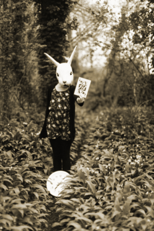
I have long associated playing cards with Alice in Wonderland and Through The Looking-Glass and consequently this image sprang to my mind quite quickly. I took a number of shots with my Lens Baby and the blur was too much of not enough, so I cracked out my old favorite 50mm and pitched it at f/1.2. The clock is another reference to AIW & TTLG.
Steps -
1 Add Noise
2 Hue / Saturation (colorize) 42 / 22
3 Lens Blur Filter, but with lower opacity on face + card
4 Resize
5 Save to JPEG
I don't imagine that the voters will like this as it won't be all clean and crisp etc., but I love this kind of imagery and that my friends is that.
Fingers crossed.
Statistics
Place: 6 out of 64 Avg (all users): 6.4737 Avg (commenters): 8.5789 Avg (participants): 6.3714 Avg (non-participants): 6.5190 Views since voting: 1888 Views during voting: 265 Votes: 114 Comments: 26 Favorites: 7 (view)
- this was my first edit! I do tend to post what I want to see rather than consider the viewer. I worried that the 'colourful'card would detract from the Silver Halide vibe I so love. The original image was reasonably sharp given I shot at f/1.2, or at least the rabbit was, but I suddenly decided I liked the really blurry Len Baby shot I took during the same shoot - it had a very lofi feel to it, but would have been at risk of a brown ribbon.....
Interesting array of comments here and I certainly agree with many of them - the surreal, eerie quality you've captured is wonderful. At first I didn't *get* the clock, I thought it was a ball until I read your comments. Very good comp, the off-centred subject adds to the unsettling feeling here. I do think that the Queen should be spot-coloured red just to drive home that it's the Queen of Hearts. I think that with just more of a closed-down shutter (and tripod) to help increase the dof and more importantly, kill the flat white on the Rabbit's head and clock, you would have finished in the ribbons. I second pretty much everything Kelli suggests.
Very good work, congrats on the score and placing. Keep it up and I look forward to seeing more entries from you!
With those props, you could have easily had the blue with a little more work. A chain to dangle the clock from (over sized pocket watch), keeping the red in the Queen of hearts card, and better focus on the card. Anyway, awesome image and congrats on the HM.
Extremely gracious image and a lovely thought also. Totally charming. Has the quality of a silver print although I wish that one element would be sharper since I cannot imagine it printed larger than what it shows on my screen and ideally I would print it 24" x 36". My top pick and the only 9.
Since it's truly my favorite, I'll give it 10.
This is fantastic, Though technically not a perfect photo the blurriness and overexposed whites really work here. I dig the desaturated sepia tone, kind of creepy, the slightly off centred subject also somehow works, well done! 8
Just wondering here, but would this have worked better if the card was in color? Maybe a little closer look rather than the soft focus? Still, a worthy idea.





 Add photograph to your favorites
 Add photographer to your favorites


 Photographer found comment helpful.


