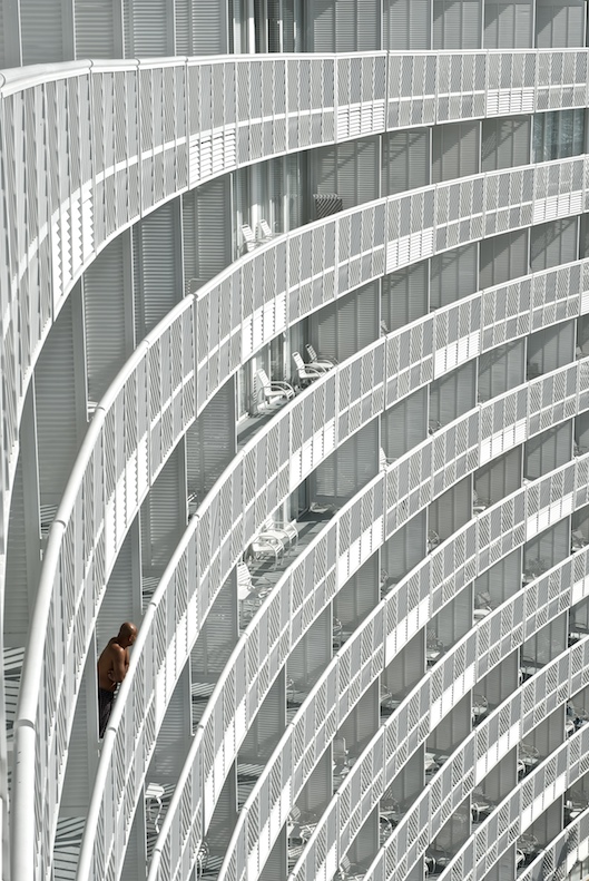
I am commenting for the thread and have not looked at the other comments yet. For me It is lacking a punch, it seems very flat. The composition and framing is nice but I feel better light and better processing would help this.
Commenting for the critique thread - I think I was on a voting hiatus when this challenge came out. Without looking at the whole challenge, my starting vote would have been a 6, adjusted then based on the strength of the competition.
I agree with the comment regarding the top row, I think it would help if that very straight row was cropped out to maintain the flow of the other levels. I think the shot would benefit from a much higher range of tones,more contrast.
Other then that, I find it quite an interesting shot, but not a world beater.
I actuall really like this shot, the only thing I could say is I would like it better if the top row of doors were cropped out, ... nit picking but only thing I could say besides LIKE IT
I really liked this shot. I gave it a 7. I thought it was well composed and a fascinating backdrop. Right or wrong, a different title might have helped your score -- although I have no ideas for a better one.





 Add photograph to your favorites
 Add photographer to your favorites

 Photographer found comment helpful.


