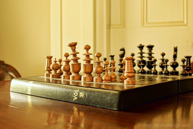
It's an interesting attempt, and there are things I like about it. The pieces look quite interesting -- I'd love to see them closer in. The chess volume 2 is interesting. But there are many issues that are getting in my way. The blown highlights on the corner of the book, the chair (is it a chair?) on the left, the back corner of the board being cut off. (this, imo, is a case of either cropping it in closer to make it an obvious artistic choice, or getting the whole thing. Right now it looks like more of an oversight.)
Plus, I think the biggest problem is that yellow is more of a background color in this shot than an important part of the overall composition.
(voted earlier) |





 Add photograph to your favorites
 Add photographer to your favorites


 Photographer found comment helpful.


