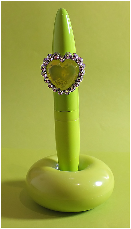
Light from the right is a little overpowering. But I like the color on color, you could have done this without the ring, which I'm thinking may have been more simplistic, but could have worked well.
Also, the pen seems to be tilted to the left just a tad.
Overall, nice colors, just a few adjustments and it would really pop off the page. |





 Add photograph to your favorites
 Add photographer to your favorites


 Photographer found comment helpful.