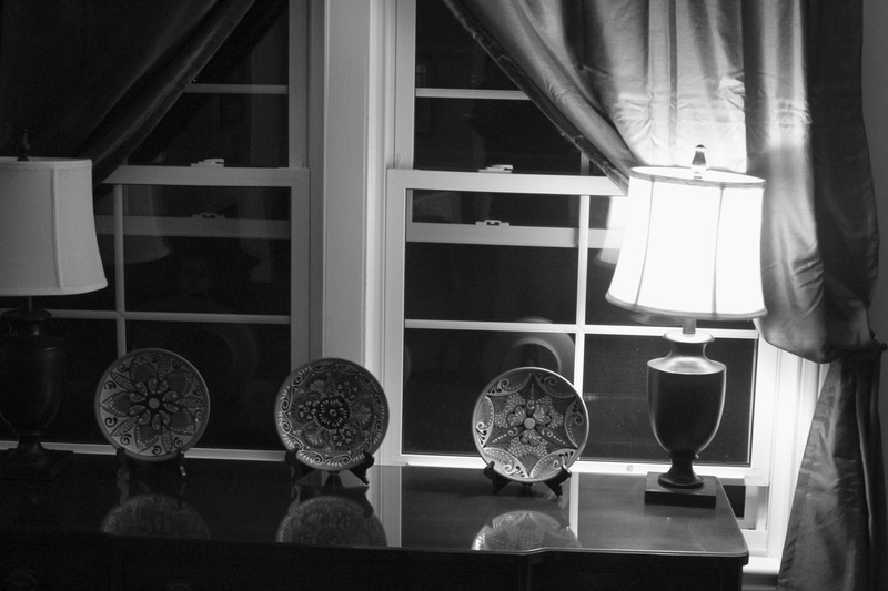
The choice of lighting is interesting, it give a certain gradient quality to the scene. However, I feel the photo is unbalanced, which is making it less appealing to me.
The lights and drapers appear to be the subject matter than the plates. Perhaps lining the plates up where they overlap and shooting in close would give a more powerful composition.
Nice black and white. The angle is a little distracting, as is the single light lit with the other off, and partially cropped off.
There's not a lot of emphasis on the plates, which is what is supposed to be the main subject.
Just my thoughts.







 Add photograph to your favorites
 Add photographer to your favorites


