|
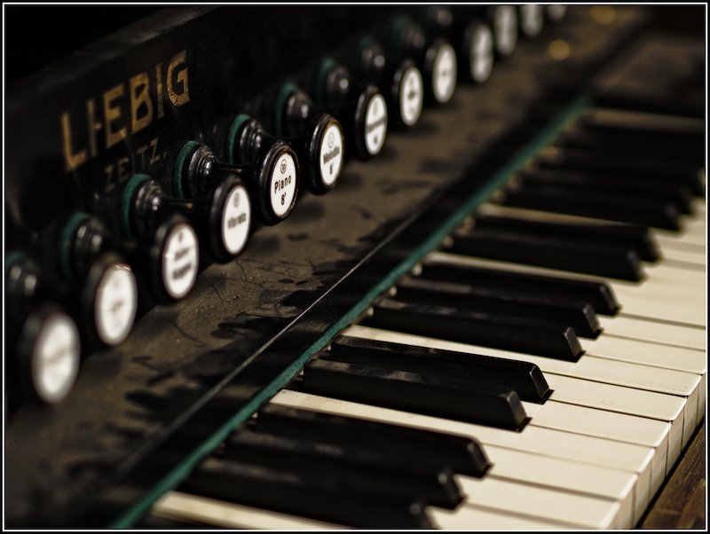
I like the way you balanced out the stops and the keys, the way you balanced the color of the dust with the color of the gold lettering. A bit more room in the lower right might have helped, that corner seems a bit squeezed to me given the space above the stops. Nice use of a tight DOF. |






 Add photograph to your favorites
 Add photographer to your favorites


 Photographer found comment helpful.


