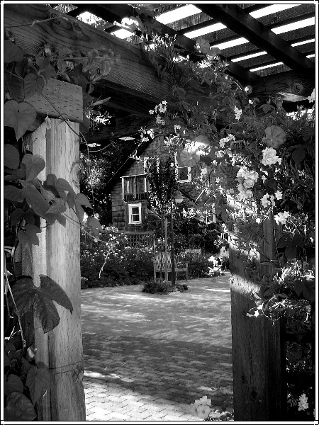
the area with the white flowers and the house is a bit messy: it's hard to tell which is which: would a colour picture have made this clearer? Otherwise a nice picture
I'd love to see what the color version looks like. I feel like the type of subject (flora) and the complex detail of the picture would lend itself to be better represented in color. In B&W, the stuff on the upper right coner of the door frame has too much going on for my eyes and it just becomes a big complicated blob of distraction without colors to help the brain figure out what's what.
this photo is too loaded with stuff... the frame should not contrain the user to see the framed object which I suppose it was the house that we barerly see. Nice lighting, anyway.
This is a very busy image for B/W imho. My eyeball is going all over the place. It took me a while to see the chair. I would love to see a color version. The lighting looks great.







 Add photograph to your favorites
 Add photographer to your favorites


 Photographer found comment helpful.


