One thing I like most about these roses is their expressive quality. Metaphorically, they appear to me to be sets of eyes that are sad and may have been "crying." Their positioning also helps to give this effect. Great shot and congratulations!
Awesome setting of light!! Great composition and B&W works great.
Although I'm sure this shot would be as perfect in color too.
Thumb up, one of my few favorits!
In my opinion, any thing as beautiful as a rose should never, never be done in black and white. Everything is right on in this photo and in color would be an 8 to a 10. In black and white this is just a 4. That's how much a rose in black and white is plain flower. Sorry, but that's how I believe. PTL
This is very pretty. Nice that you have the drops of water on it for interest. Love the black background on this. A 9 because I would have liked more even lighting on the left side of the roses. Great picture though! Good luck! P.S. a good title for this might have been A quarter of a dozen. :-)
Talk about a brilliant B&W study. This is it!. A real first rate classic image. Echos back to those Weston days of the f/64 group. Gorgeous feel of firm softness to those petals. A wee tad hot on some of the highlights ( just my opinion ). Glad you included a couple of token petals. Wish both of those petals were dark ( a minor complaint ). A couple of the waterdrops are lost in the brilliance. But the other 50% of the waterdrops are lovely to behold because of their specular highlights and wee inner droplet shadows that make them feel wet. Personally I would like a little softer lighting arrangement to be a bit kinder and more gradual tones in the shadows. But on the otherhand you may intend for the more harsh graphic look in the first place. And in that case I would be on wrong base. This lighting does illustrate the shape of the individual blossums very well at minor expense of some texture. I feel that this is a distinguished worthy effort that deserves reasonable praise for sincere effort. Continue with your fine work..7





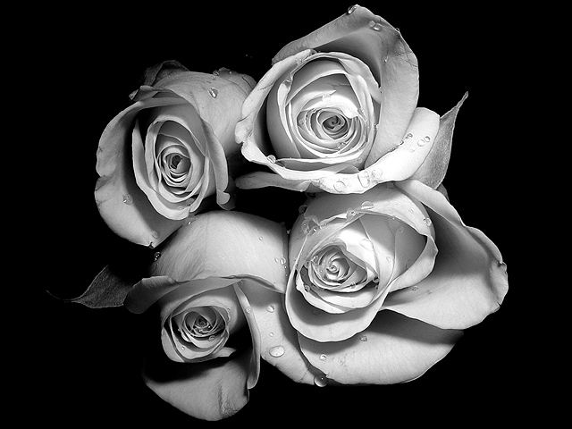
 Quatro Rosas
 Add photograph to your favorites
 Add photographer to your favorites


