Greetings from the Critique Club!
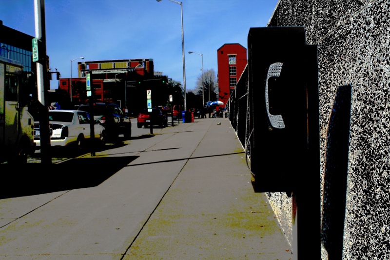
This feels almost like a scene from a graphic novel or RAW magazine, with the stark shadows, flat colours, use of angles and grey tones. Interesting use of processing, you could make this your own style if you so choose. Be warned though that such pp is verging more on digital art than photography and voters may take you to task for it.
My main nitpick is the colours versus shapes, the colours are vivid but highlight relatively unimportant areas in the shot. The old corded phone box by the wall is the focal point, but it's fighting for its life! I like the shadow from the phone pole touching it from the left side, it helps to draw attention to it. The red building behind the phone box drives me a little nuts because it does help draw the eye to the phone box but then the colour detracts from it. Argh! :-)
Overall a very interesting shot, the kind of thing that may eventually grow on the dpc crowd in time. In the meantime continue to shoot and enter what you like.
Feel free to PM me,
Susan |






 Add photograph to your favorites
 Add photographer to your favorites

 Photographer found comment helpful.


