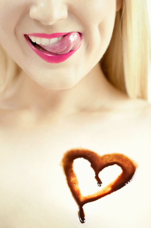
I love the upper half. The mouth and tongue are fabulous. However, I am a little bit let down with the messier drippy lower half. The two halves do not quite mesh as well as I might like. Think this is a good idea that fell a bit short for me.
Haha, seductive to say the least. I like the way you composed/framed/cropped this. I think the sharp focus on the mouth (okay, the tongue) and the soft focus on the heart works for the mood/impression/message to your audience (okay, guys like me...haha). You can't beat that smile that she has. You should sell this to a card company for a Valentine's Day card. Nice job.






 Add photograph to your favorites
 Add photographer to your favorites


 Photographer found comment helpful.


