I don't want to start another "why did this fail?" thread, but I was disappointed in my score and would appreciate some more feedback.
I chose the final crop because I thought it emphasized the player's muscle tension at the swing (and the sharpness of the photo). I went with the pale processing because it seemed the most accurate catch of the bright, hot, humid day, but someone whose opinion I respect pointed out it was flat. Are these things where I went wrong with most voters, or am I missing the point and it's just a blah photo?
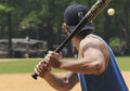 - my entry - my entry
 - would more contrast have made a difference? - would more contrast have made a difference?
 - more context? - more context?
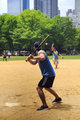 - lots more context? - lots more context?
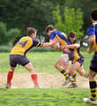
FYI, I had some non-baseball potentials, too:
 
Message edited by author 2010-05-12 11:26:09. |