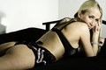
It's been a while since I posted one of these. It's also been a while since I received under a 5 for a "People" photo. So why is this a 4.9 photo? Why were there 31 sub 4 votes?
I have tough skin so be honest, just be respectful.
I gave it a 5. It's not the sort of photography i particularly enjoy unless it is pretty original and different so i wasn't really interested in the subject matter. I also don't really like the models pose and the crop much. Still, a 5 because i can see its technical photographic qualities.
Your score was probably hurt a bit by folks who just don't vote high on nude / partial nude shots.
Her body position is almost rejective, glancing back over her shoulder more as a curiosity about what you said or finding you amusingly distasteful, rather than in an desire to engage the viewer. Her wonderful, open facial expression is almost a contradiction of her body position, but not sending a clear message one way or the other.
Besides the shadow on her face, there is a shadow on the left edge of the photo in the white, the futon arm is a strong element that seems to serve no purpose, and her elbow is cut off by the sheet. Nits, true, but dpc is not known to be a forgiving crowd.
For me, overall, there is just no sizzle - a nice photo, but... (no pun intended)
We have alot of prudes hanging around here these days.
Ha! I am certainly not a prude (you should see my felching in close-up series) so i think that is a lame explanation for the score. I just don't find there is much exciting or interesting with the shot. Its a girl on her belly, looking over her shoulder and going 'Look, here's my arse'. I can walk to the local shop and find the same pose in a hundred different magazines and newspapers. There is a market for that style of course and it is well executed i guess hence the 5. 5s a good score from me though so i'm not speaking for the 1,2 and 3 givers.
The lighting is uneven across her body - angular shadows in different areas - bright spot on her far shoulder blade but a dark back transitioning into a light butt. Shoulder cuts off the face and leaves a tough shadow. Walls are two different colors and shadow on left is distracting. Rail from furniture is also distracting and only points out the difference in wall color more. It looks like she is sunk into the cushion - sharp division between fabric and skin (elbow)- almost looks 'fake' or painted in.
Title, IMO, hurts as well. I see nothing sexy or angelic in her appearance or pose.
Some things that I think detracted:
- Rather harsh lighting (not necessarily a killer in itself but see also below)
- Deep shadows where detail has been completely lost
- Unflattering shadows in a few areas (right cheek, left, um, cheek)
- distracting shadow on the wall
- Elbow hidden by fold in blanket
- Has a rather over sharpened feel to it (not badly so, but a little softer might have worked better
- The BG, crop, and pose don't really bring anything to the shot, IMO.
So I think, in the final analysis, that the last point above is the key. It's not going to score well unless it's lit and processed exceptionally well, and then only a moderately good score. Because voters have relatively little time with a shot, the initial impression, largely impacted by composition and lighting, are the major determinants of score. Even a shot that is incredibly difficult to get, and technically perfect, will not score really well if it misses on the basics.
All great comments. And very understood. Still not sure about the 31 sub 4 votes.
I've read the pose is unflattering...this isn't my daughter, sister, wife, girlfriend...so what is unflattering about the pose?
I knew the shadows would hurt the photo some...but if you look at my last challenge entry I accidentally left a shadow across the middle of her face and it hurt the photo some....but not 4.9 hurt.
I think the pose is fairly unflattering - but I'm most concerned with the cool tattoo being an afterthought. My eyes dart about the image, as there are several distractions (including the shadow on the face), the background, her skintone (mottled), etc.
The Angel portion was a subtle reference to the Wings tattooed on her back. Rather than just posting a title with her name.
That may be, but only you know there are angel wings tattooed on her back. From the small portion visible, I could not tell that is what her tattoo is.
Trust me when I say, There are prudes here so it was hardly a lame explaination. You could search the forums and find dozens of threads where people have shown their disapproval of the slightest bit of nudity in a shot. Alot of them have openly admitted to voting shots with nudity in it low just because they do not approve.
Originally posted by clive_patric_nolan:
Originally posted by Bugzeye:
We have alot of prudes hanging around here these days.
Ha! I am certainly not a prude (you should see my felching in close-up series) so i think that is a lame explanation for the score. I just don't find there is much exciting or interesting with the shot. Its a girl on her belly, looking over her shoulder and going 'Look, here's my arse'. I can walk to the local shop and find the same pose in a hundred different magazines and newspapers. There is a market for that style of course and it is well executed i guess hence the 5. 5s a good score from me though so i'm not speaking for the 1,2 and 3 givers.
I would have given this either a 4 or a 5, depending. (And I'm no prude.)
For me eye flow through the image does not draw my eyes to the model, my eyes are always drawn to the white wall on top/left. Had you flipped the image 180 degrees and you would have scored one full point higher, imho.
Eye-contact with the model is easier, and the lighting / pose / shadow distractions become much less obvious.
To wit:
(Image flipped for demonstrative purposes, I will remove the image at OP's request.)
I would have given this either a 4 or a 5, depending. (And I'm no prude.)
For me eye flow through the image does not draw my eyes to the model, my eyes are always drawn to the white wall on top/left. Had you flipped the image 180 degrees and you would have scored one full point higher, imho.
Eye-contact with the model is easier, and the lighting / pose / shadow distractions become much less obvious.
To wit:
(Image flipped for demonstrative purposes, I will remove the image at OP's request.)
Hard-edged shadows (especially on the face, where it's very bad form), black clipping, shadow without context on the wall, and generally an unflattering pose make this a sub-five. About the title, my guess is it would be impossible to connect the "angel" with the wing tattoo, which is not prominent and virtually unrecognizable as a wing.
I would have given this either a 4 or a 5, depending. (And I'm no prude.)
For me eye flow through the image does not draw my eyes to the model, my eyes are always drawn to the white wall on top/left. Had you flipped the image 180 degrees and you would have scored one full point higher, imho.
Eye-contact with the model is easier, and the lighting / pose / shadow distractions become much less obvious.
To wit:
(Image flipped for demonstrative purposes, I will remove the image at OP's request.)
Trust me when I say, There are prudes here so it was hardly a lame explaination. You could search the forums and find dozens of threads where people have shown their disapproval of the slightest bit of nudity in a shot. Alot of them have openly admitted to voting shots with nudity in it low just because they do not approve.
Raises hand - In this challenge showing some skin wasn't so bad I guess as the challenge was to post something in your "style" of photography. What really bugs me is when skin (nude or mostly nude) is shown in challenges and the entry is vaguely (if at all) related to the challenge. It's the "sex sells" strategy and I personally don't care for it.
Trust me when I say, There are prudes here so it was hardly a lame explaination. You could search the forums and find dozens of threads where people have shown their disapproval of the slightest bit of nudity in a shot. Alot of them have openly admitted to voting shots with nudity in it low just because they do not approve.
Originally posted by clive_patric_nolan:
Originally posted by Bugzeye:
We have alot of prudes hanging around here these days.
Ha! I am certainly not a prude (you should see my felching in close-up series) so i think that is a lame explanation for the score.
Ok, i do trust you as to there being prudes here. I just don't think that everyone who voted low on the image can be explained away as being prudes. I get your point though.
To me it has the look of a snap shot with very little concern for the lighting. I think the model is very pretty but the photo did not do much to capture or enhance her beauty. I did not vote but would have likely voted it a 4 or 5.
Since she was on her stomatch I would have probably asked her to remove the bra, and tilt to show the tattoo more and played with some poses that might have lent themself to highlighting that point on her. I didn't vote in the challenge either and I am no prude. I probably would have given it a 5. The shadow on the wall and her face hurt it for me and I didn't find it overly interesting. I think flipping the image helped it a lot by the way.
2 > a technically lacking photo with little or no perceptible artistic (choice of subject, composition, perspective, manner, emotional energy and range, etc.) merit or interest, even when generously considered; a somewhat 'offensive' photo or an indelicate and inappropriate sentimentalization of feeling; the pursuit of cliché without room for even a latent interpretation (irony, allegory, metaphor etc.)