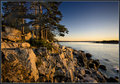
This is my entry, Which I guess was underprocessed for the HDR theme.
This is the photo I uploaded the second or third day after challenge was announced, Only to replace it with my entry just before voting started.
on a Side Note, Judi if you read this in the next hour or two, If you are not busy and willing to help, I would like you to give me some advice on my next entry. send me a PM and I will link you to the photo and tell you what I need to know.
Nevermind that side note. I have decided to do something different.
Not outtakes, but alternate edits. I was wondering if either of these would have done SLIGHTLY better. I know the subject matter let me down - I treated this purely as an editting challenge as I didn't have time to get a photo I really liked.
Thanks everyone for your (good and not-so-good) comments on this photograph:
Specifically,
@bassbone, @vlado:
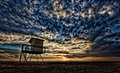
Here is another version of the same image, with a little of the oversharpening removed around the lifeguard stand. It's tough to remove all the sharpening artifacts when tone-mapping to that extreme.
@kivgaen:
It was relatively dark that evening. Have you calibrated your monitor? ;-)
@LadyK:
Yours was a unique comment. Everyone that thought it was overprocessed didn't seem to like it. You said it was overprocessed, but liked it! Thanks!
@ineedauniquename:
The title is an abstract title.
Karen, sometimes centered works just fine. Not a hard and fast rule, and with your lighthouse, centered works quite well. The placement of the lighthouse and the angle of the cliff/foreground seem to balance that center line very well. Gorgeous picture. You'll have TONS to choose from of course, but you could always keep it in mind for "Best of".
Steve, I like your entry better than the other two version. From the thumbs, and then to the full sized versions, the alternates are too "gray" and dull in comparison. You could try brightening those versions up a bit (brightness/contrast, levels) to see if you then prefer that software's output.
...the ones I should have entered, given enough time.
Definitely not. The entry was way better, with a great sense of depth and tastefully done HDR. The other two are way overdone in my opinion, and look very flat and grainy.
ARGHHHHHH!! I always have trouble picking entries, I almost went with this one but thought the horizon was too centered and people wouldn't like that.
I do it all the time. Not sure if people LIKE it or not but I do it all the time :-) I say "A pox on all idjits who are so hung up on rules that they can't see when a centered horizon works well!"
In fact I entered one in this challenge. Not only that, but the masses created a horizontal centering as well as the vertical one, and this was only slightly offset by the "wedge" of the ocean itself. I thought it worked pretty well, but the voters thought it was so-so I guess...
Of course, apparently folks thought this wasn't "HDR enough" for the challenge. It was my thought that I'd like to do a TRUE HDRI for this challenge instead of a dramatic, overdone tone mapping of reality, but I think I guessed wrong. I could, for example, have entered this:
or this: or this:
And I suspect these might have fared better. So it goes...
My entry, with which I was quite happy. Three exposures, handheld with the fastest at 1/50th. HDR did bring out the warmth and color of the lighting, though the un-HDR version is OK, too.
I did shoot quite a bit for this challenge - here are some of the others, including a couple where the subject was moving, which is really kinda fun!