And was very disappointed with a score of 5.1811 in Duotones IV.
One comment - a "well done"
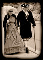
This was taken on Mackinac Island, MI - a local couple dresses in period and walks around the town.
I thought the processing was well done. Great subject. I didn't like the heavy boarder. Gave Ya a 6, would had given 7 or higher if it wasn't for the boarder.
I didn't vote on this challenge, but I agree about the background. Seems a little flat and the blacks are clipped out completely. I love the idea and the expressions on the faces. Maybe a less prominent vignette would have done better.
i like this picture, but i think that would be better if you framed the entire couple, avoiding to crop the woman out on the left of the frame... i also dont like the white (wall?) on the left (and this could probably had been the cause of your cropping choice...). the straight look of the man is interesting, but maybe i would prefer something more candid...
BTW... i gave you a 6.
I gave it a 5. For some reason it just didn't grab me much. The only real thing I can put my finger on is the crop is a little too tight for my preference. I usually try to comment more on the 4's and 5's, but I really could not nail down enough to leave an explanation.
I knew the tight crop on the left was less than ideal, but there was a large unattractive sign on top of the fence. The background was white, but the lettering was VERY distracting, so it almost had to go. I tried to crop tight enough to almost loose the sign board while keeping most of the umbrella.
Also, this is 100 year sepia with Paint Shop Photo Pro X2, so there really is no black - just dark, dark brown. Maybe there is a better way to do sepia with PSP.
I tried a light brown border, but felt that the heavier, darker border did more to define the shot content than a lighter border. Again, I was fighting edge distractions, which the heavy border helped cover, so maybe I was too ready to accept a compromise that really worked against the shot overall.
Is it really the border itself, or is it that the heavy vignetting / dark border makes the crop feel too tight?
Edit - BTW - this was really a candid - the couple was walking, and the man just happened to look at the camera as I took the shot, which made it a kind of special capture for me.
I think it's both the thickness and darkness of the border that makes it feel tighter than it already is. A white vignette or border would have been better, IMO
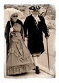
still too thick, but trying to cover the dark border.
The photo itself is still a bit flat though - needs some curves or levels or contrast adjustment.
...could use a Godzilla as well, but rules are rules.
Also, this is 100 year sepia with Paint Shop Photo Pro X2, so there really is no black - just dark, dark brown. Maybe there is a better way to do sepia with PSP.
I assume you are referring to the "Time Machine" setting? About the only treatment in that section that I have liked has been "Platinum", and that was because I liked the b/w conversion it did. I find myself using it rarely now.
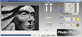
I think the key is converting to b/w first in order to get the tones and detail you want. My preferred method of doing a sepia now is to first convert to b/w using this plugin:
Assuming the gentleman's outfit in your photo is dark blue, you could then adjust the blue or cyan channels to gain some visible detail.
With the built in tools you can use Effects--->Photo Effects--->BW film, and select a color filter to achieve the tones you want.
This way I first get the tonal range I want and can adjust individual color channels for the conversion. It's like the channel mixer, but with more fine grained control.
And then I go to Adjust--->Hue & Saturation--->Colorize. From here I can select the tone I want and the saturation level. If I can't get the tone I want from here, I can get a little more control by going to the HSL adjustment and clicking "Colorize". In this dialog I also have a lightness control.
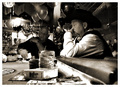
I did this challenge entry using the BW film effects menu and then colorizing it to taste: