I really thought I would get in the top 20 with my entry. Really thought I should have done a little higher than some that did better than mine. Does anyone think my outtake would have scored better? Please leave me some comments. Thanks
I really thought I would get in the top 20 with my entry. Really thought I should have done a little higher than some that did better than mine. Does anyone think my outtake would have scored better? Please leave me some comments. Thanks
Entry:
Outtake:
Neither image seems particularly "untamed" to me, nor do they speak to my "yearning to be free", which would imply a wind-in-your-face-open-road shot to me, so I think you have a conflict between the image and the message that's hurting your scoring.
I was working on this one for a while, but it seemed way too cluttered and too gearheadish, so I scrapped it and went with the yellow Roush instead.
R.
Was that really a 2010 Roush in your entry though? The one you pictured looked like a regular 05-09 GT. The 2010 Rouse has new headlights and the large fog lights are in the front bumper as well as a set in the grill. That's actually the first thing I thought when I seen your entry.
I don't think your GT500 under hood shot would have done that well though. It is a bit cramped.
Was that really a 2010 Roush in your entry though? The one you pictured looked like a regular 05-09 GT. The 2010 Rouse has new headlights and the large fog lights are in the front bumper as well as a set in the grill. That's actually the first thing I thought when I seen your entry.
I don't think your GT500 under hood shot would have done that well though. It is a bit cramped.
I know it was a Roush, that was all over it and under the hood. I googled and the hood treatment with the huge bulge with a backward-facing vent only seems to show up on 2010; earlier versions have a smaller, forward-facing scoop. I'm pretty sure it WASN'T a 2010 'cuz of the lights, but I took the liberty of calling it one since this *was* supposed to be an ad and who'd advertise last year's car that way? Jejeje™
But yeah, you're right, I'm sure it ain't a 2010 and I fully expected comments to that effect from the motorheads :-)
Thanks, I did think my entry would do better though, oh well...
Well, you were third 'stang to finish :-) I think you handicapped yourself by cutting off half the car, actually. It made for a strong composition but perhaps not as appealing an ad...
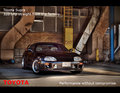
yes it is!! (well, almost the same, it is actually 100 yards apart, you can see there is no pav in this one)
and I felt kind of guilty for the lack or creativeness :-)
Originally posted by Judi:
Originally posted by nutzito:
Isn't that the same location as this image that happened to win blue in the last Automobile ad??
Thanks, I did think my entry would do better though, oh well...
Well, you were third 'stang to finish :-) I think you handicapped yourself by cutting off half the car, actually. It made for a strong composition but perhaps not as appealing an ad...
R.
Personally I think what hurt me the most was the background. I thought the wording went well because the car was an "in your face" image like the text describes. I am still trying to learn how to do many things in PS and can't quite figure out how to get a nice blurred effect yet that looks good. I've been trying but have been coming up short. I think if I would have blurred out the background to achieve a better depth of field (like 1 of my comments suggested) I would have done a little better. Who knows though.
This is my outtake. I was a little worried about this one with the artwork thing. I added the text (obviously), but it's the back door panel of the chevy I entered. I left the hinge showing but still wasn't sure.