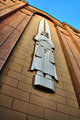
I am surprised that a shot I am sure is sharp, well exposed and decently composed is a sub 5. The lone comment I received suggests the relevance to the challenge was too subtle and did not come across. The lack of comments combined with the score suggests there was not much to critique but it had little appeal either. So, maybe it was just boring? Thanks for any additional insight.
Didn't vote on the challenge, but in looking just now, I didn't figure out that it was painted on. I just figured it was a cheaper stone or metal or something. If people are like me, they didn't understand it.
edited to add: the painted on is bizarre--if you would have actually said that in the title, I think people would have thought it was cool.
some people may have (mis)interpreted this shot as a suggestion that religious symbols are "not quite right", and got slightly put off by that. I noticed that anything even remotely related to religion is a very touchy subject here
I am surprised that a shot I am sure is sharp, well exposed and decently composed is a sub 5.
Well, in the "Not Quite Right" challenge, my shot which is not quite in focus, a little too dark, and a bit too grainy (for DPC) came in under 4, so you can't win whichever way you go ... :-(
Hate to say it but I think regardless of the Challenge or the title, you have a technically very good shot of a subject that is not very interesting. Also, there is not very much of the photographer's 'authorship', if you know what I mean - the 'interestingness' lies in the statue, which you documented well, but there isn't much 'you' beyond that.
I am surprised that a shot I am sure is sharp, well exposed and decently composed is a sub 5. The lone comment I received suggests the relevance to the challenge was too subtle and did not come across. The lack of comments combined with the score suggests there was not much to critique but it had little appeal either. So, maybe it was just boring? Thanks for any additional insight.
Well, and this is strictly my opinion, the title didn't make any sense. I know what the point was, but the simple truth is that stainless steel, in particular in the size this sculpture was produced, is damned expensive - it would have been cheaper to do a sandstone or pressed stone facia sculpture by a factor of ten. :>)
Secondly, it just not that interesting. Granted, the focus is sharp, the angle is interesting, but the iniital impression is - eh... I think it may have more to do with the the rather flat tan color of the stone and lack of luster on the stainless - it's just looks - um...blah. Additionally, the image is also "flat" without much dimension or depth - it seems odd to say given the angle, but it's true - it's 2D in impact.
Now if it were me, I might have tried a little closer look at the sculpture with a different lens and maybe bounded a flash to make the steel stand out - give the image some pop.
Anyway, that's my story and I'm sticking to it. :>)
Thanks for all the feedback. In a nutshell, I had a technically good but uninteresting photo and the relevance to the challenge was too subtle.
Hey Steve - Thanks for the thread. I think I'm getting some fallout views from people looking at yours. :-D
I didn't get a chance to vote or even look at the entries in this challenge. After seeing yours for the first time I would agree with others that the painting part was totally overlooked and misunderstood. Definitely a cool find.