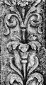
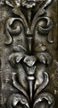
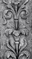
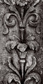
I am wanting to learn how to get a deep tonal B&W picture, I have a shot that I want to convert to B&W but I am at a loss as to how to make it "pop" or look it's best, I just can't seem to find that "deep tonal" feel...is anyone interested in helping me learn how to take this from ordinary to wow...I am using Photoshop Elements 7 (PSE7).
Is this anything like what you're looking for? I'm not sure what you mean by "deep tonal" B/W, but in general the goal with a full tone B/W image is that it has areas of black, areas of white, and a full expression of the tones in between. Any B/W image that consists almost entirely of mid-tones is going to be perceived as "muddy", as a rule. There are, of course, exceptions to this but...
strangeghost is more of the smooth tone, but it is still in color and what is "NEAT"...I know that you can go into Enhance> "CONVERT TO BLACK AND WHITE" but I don't understand how to use the "red, green, blue and contrast"...I have played with it but not getting what I want....you can also go to "enhance> adjust color> color variations and once again...I just don't get how to work with the settings...
and BAMartin used quadtone, what is that and where is it...I like happened with the saturation, I guess personally I like the "darker" tones
Bear_Music I have seen some of your photos and how you get that really smooth, dark tone to you photos...that is what I am looking for...
levels
s-curve with midtones bumped up
channel mixer b/w conversion. red 100, green 6 blue 5
duplicate
Gaussian blur on duplicate layer
blend soft light 79% (Lost some detail but made for smoother tone transitions)
high radius USM on lower layer to increase contrast
merge
Noise reduction (killing some more detail for the sake of smooth tones)
clarify +3
very slight blue duotone
USM, .35, 50, 5
So, I am not quite sure what you are looking for, but I decided to go for some "pop" per your original post. I over-did it deliberately.
I use Aperture, with the Nik Silver EFX conversion plugin, but this could also be done with the 'monochrome mixer': effectively, I did a straight conversion, applied a blue filter setting, and played around with Hi, Mid, and Low contrast levels. Sometimes, "pop" means "local contrast" and this image subject is very granular and textured, so lots of little bits everywhere to brighten for "pop" or "snap".
But I am making assumptions about what you want, and what you mean by pop.
It is easy to over do it, as you can see from my edit :-)
BAMartin...really like the link you sent me...I can see how that would improve my photos...but will it work in PSE7? I haven't done any "plug-in's" yet...
Yo_Spiff...this is more of what I am looking for...I know the photo is "grainy" but you seemed to be able to "smooth" it out...
How do you know how much red/green/blue you need...and I really can't tell from my "experimenting" very well...is there a rule of thumb in other words?
it is a combination of Yo_Spiff and Strangeghost is what I am looking for...and wonderful tip about the quadtone from BAMartin I am hoping it will work in my PSE7
Here's a quick edit... but I'm not sure how much of my approach is directly reproducible in Elements. This was done with CS4:
Processing was as follows:
- Straightened
- Curves and USM with radius 5 and amount about 25 to raise global and local contrast respectively
- USM with radius 0.3, amount 150, threshold 5 for (over)sharpness
- Channel mixer to convert to grays, Red=40%, Gr4een=22%, Blue=43%
- Duplicate layer, gaussian blur of 2px, fade layer to 20% opacity
- Fill layer with Pantone 876C, set to "Color Burn" blend mode and fill reduced to 18%
There is likely a path to get a similar result in Elements, but someone more familiar with Elements would have to provide guidance.
How do you know how much red/green/blue you need...and I really can't tell from my "experimenting" very well...is there a rule of thumb in other words?
I don't know if there is a rule of thumb. I experimented with the amounts until it looked right to me. One thing I am learning about the channel mixer, is that minor changes in values can make a noticeable difference.
The smoothness was gained from a combination of the gaussian blur overlay and the noise reduction.
(Note: I use PaintShop Pro, adjustments may be slightly different in Photoshop)
How do you know how much red/green/blue you need...and I really can't tell from my "experimenting" very well...is there a rule of thumb in other words?
I don't know if there is a rule of thumb. I experimented with the amounts until it looked right to me. One thing I am learning about the channel mixer, is that minor changes in values can make a noticeable difference.
The smoothness was gained from a combination of the gaussian blur overlay and the noise reduction.
(Note: I use PaintShop Pro, adjustments may be slightly different in Photoshop)
couple of question...when do you use Noise reduction? and what exactly is "channel mixer" (I am probably already using it but don't know what it is called...
Can you link a picture that looks like what it is you are trying to describe?
you asked for some examples...
Yo_Spiff his tones are "darker" and he still has "definition" of the stone
while yet kirbic is dark, you still get the "feeling of depth"
then strangeghost photo is "smoother"...I am trying to find out what "NEAT" is and is it on PSE7 or not....
I am going to do Yo_Spiff's steps later tonight and hope that I can find out what the NEAT thing is...also will try to do the download for the Quadtones and see if it plugs-in to my PSE7 or not...
thank you for helping me....I have gotten some good ideas now and really appreciate you taking the time to wk the picture....
By "Neat", I think he means the NeatImage noise reduction plugin. A more advanced version of the built in noise reduction in many image editors. Noise Ninja is another popular one.
I normally use noise reduction after levels and curves. That is the point at which I can gauge about how much NR I will need to apply and where. It sometimes varies though as to exactly what point I do it. Sometimes I do it selectively with layers and then erase through where I don't want it.
Here is the channel mixer in Paintshop Pro. Photopshop Elements ought to be similar. I believe full Photoshop CS gives more channels and finer control.
NEAT is presumably neat image. Those examples are just people trying to guess what it is you are looking for. Can you point at a picture that IS what you are looking for?
By "Neat", I think he means the NeatImage noise reduction plugin. A more advanced version of the built in noise reduction in many image editors. Noise Ninja is another popular one.
I normally use noise reduction after levels and curves. That is the point at which I can gauge about how much NR I will need to apply and where. It sometimes varies though as to exactly what point I do it. Sometimes I do it selectively with layers and then erase through where I don't want it.
Here is the channel mixer in Paintshop Pro. Photopshop Elements ought to be similar. I believe full Photoshop CS gives more channels and finer control.
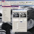
ok, now I understand...I have a "channel mixer" under Enhance> Adjust Color > Color Variations as well as in the Enhance> Convert to Black & White...Now I need to learn how to use them...I just didn't know that was what they were called...
I haven't ever used Noise Reduction...could you give me some example of "why" you would want to use it...in this photo..it is quite "grainy" so that would "quite" some of that down right...
Does any one know if I "CAN" plug-in the Neat Image and the Quadtone in PSE7?
yes, Robert, this is more of what I am looking for...possibly just a bit darker (deeper tone)...but your editing keeps the details and doesn't let the noise take over.... Thank you...
Guess it is time for me to leap off here and see what "I" can come up with...hmmm
could you give me some example of "why" you would want to use it...in this photo..it is quite "grainy" so that would "quite" some of that down right...
Does any one know if I "CAN" plug-in the Neat Image and the Quadtone in PSE7?
Yes, that is why I used noise reduction on this. Not to eliminate noise, but to smooth out some of that grain detail.
Yes, neatimage should work as a plugin in Elements. It also works in PaintShop Pro.
here is my attempt...this is done not knowing what the parimaters of noise reductions should be...(starting point)...I wish this was a little "smoother"...I need to do one of the plug-ins...