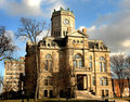
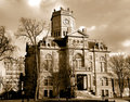
I've been trying to get a good shot of this courthouse in my hometown for quite sometime and never seem to quite get it right. Today, I wasn't out looking to take a shot, but did have my camera with me. Went around the block twice talking myself into stopping and taking the time out in the cold. I thought the light was good, the random clouds an extra bonus, and knew I'd have to get a shot like this when the trees are bare to highlight the building.
I take a lot of hometown shots and sell quite a few prints at local art shows. I have not had one of this building. Do you think this might make a good print? It's tack sharp in the full res. Do you prefer the color or sepia? Comments welcome, thanks!
Seems that you finally were there with the light just right. I think I like the sepia, because it enhances the clouds and brings out all the details of the stonework.
The sepia, fo sho. What's the big red thing on the left-hand side?
That's an old bank building across the back street from the courthouse. If I make the color version a print, I will be desaturating the red that you see behind and to the left of the courthouse - which is part of the bank building sign.
The sepia, fo sho. What's the big red thing on the left-hand side?
That's an old bank building across the back street from the courthouse. If I make the color version a print, I will be desaturating the red that you see behind and to the left of the courthouse - which is part of the bank building sign.
Ah, that makes sense. Looked like it had a wind-up key stuck in it!
I've replaced the originals with updated edits which have reduced the red in the sign of the building behind the courthouse, slightly more cropped, a little more contrast in the color version, fixed the perspective of the tower just a bit - any further and it just didn't look natural to my eye. I also changed the sepia to a little less red/pink tone that I felt would look even redder in the print version.
Any updated opinions welcome :) Especially on the perspective. I thought an angled shot might help rather than doing a straight on photo. I've not really used the perspecive tool much, but does this building seem to be "natural" or acceptable to the eye?
I like the color version better. It has better depth; the sepia seems flatter and less interesting. However, depending on your market for prints, the sepia may have some appeal to those that want a photo that reflects the age/historic feel of this building.
I like the color version better. It has better depth; the sepia seems flatter and less interesting. However, depending on your market for prints, the sepia may have some appeal to those that want a photo that reflects the age/historic feel of this building.
The perspective looks fine.
Sorry...probably not much help. :-/
Yeah..I really need to get the sepia printed up and then adjust accordingly. What looks good as sepia on my screen doesn't always print up as well. Thanks for the comments :)