Just so we're clear, I created this thread after I got the idea from this thread.
If you want to hear good things about your photo post it somewhere else. The purpose of this thread is to hone a critical eye of photography and to help thicken some skins.
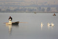
The first thing I noticed was this shot doesn't look like it took much work or thought. Anyone standing on the shore or pier or wherever you were with a camera phone easily could have taken this shot. It's boring because it's ordinary.
The man in the boat is in an awkward pose - with his hands in that position it looks as though he could be "watering a tree" - ;) ;) I realize he's probably doing something with bait but it still looks weird.
The background is too flat. Your image has no depth.
Lastly there is no real theme - is it about fishing? is it about birds? What does one have to do with the other? You could crop this into 2 different photos and they'd both end up being better than this one.
Therefore your image has been rejected. Try harder next time ;)
Great thread. I might throw some of my own photos in here tomorrow. Thing is, I generally know exactly what is 'wrong' with my photos and don't really care anyway ;)
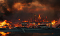
Is this really the best you can do? It's so dark in most places I don't even know what I'm looking at. The whole thing is filled with fire - shouldn't that create SOME kind of light?
There is no real subject in the picture. The largest flames are on the side and they aren't anything special. Other than that it's just a pile of rubble. Next time try getting a fireman, a dog or a baby in the shot. Anything to make it more interesting.
The color seems off - why are the tips of the flames red - and in some spots leaning towards the magenta side of the scale.
Hmmm... this is a tough one...
I like the overall artsy feel of it. I could easily see it selling for $100,000 in a gallery... if you were famous, which you are not so FAIL.
The overall mood is good - reminds me a lot of my childhood. Part of me thinks you should use a light source next time, part of me thinks it's perfect the way it is. I can't decide so I guess I FAIL.
I don't like the aspect ratio. Try something more exciting next time. It's ok to crop a picture to make it better.
This was a close one. There's never been a photo I've wanted to accept more. Maybe post some of the outtakes on this one, you are so close. Sadly, I have no other choice but to reject it though.
Having not been in the US of A for the past couple of years, and having not watched television for longer than that, I fear I am often out of touch with the latest and greatest in slang. I take it "FAIL" is highly used now as a single "you have failed" proclamation?
Having not been in the US of A for the past couple of years, and having not watched television for longer than that, I fear I am often out of touch with the latest and greatest in slang. I take it "FAIL" is highly used now as a single "you have failed" proclamation?
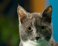
This could have been a truly amazing image. Unfortunately it's not though.
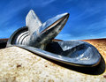
The lamp looks like it sneezed at you while you were taking the picture. Learn to use fill flash.
The line of the car is interesting but too dark.
It appears over sharpened. If the snow had a softer quality to it the whole thing would take on more of a dreamy and less of a "some one is throwing sand at you" feel to it.
It's the right idea, just the wrong execution. Therefore your image has been rejected.
(Great thread, by the way. Saves me time by not clicking to another site for rejection!)
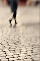
Ah yes... the Lens Baby. I actually like Lens Baby pictures when executed properly. It can really add something to an otherwise mundane photo. In this case it did not.
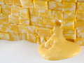
Why the bricks? What's special about them? Why do I want to look at them? The blur explodes right out of them and everything screams "LOOK AT THIS SPOT!!!!". So I do and I see bricks. Yea... So... ?
While the overall color of the image is nice and warm, with the blur it kind of takes on the coloring of an injured rabbit. It's interesting that red is used so often in an image to draw attention but here's an instance where a little blue or green really would have popped out and perhaps kept my attention longer.
My eye is constantly drawn out of your picture. I try and look at it for more than 2 seconds and inevitably my eyes always wander down and left - right out of it and then I wonder why I'm looking at it. Between that and the bricks I really do wonder why I'm looking at it. Therefore your image has been rejected.
Having not been in the US of A for the past couple of years, and having not watched television for longer than that, I fear I am often out of touch with the latest and greatest in slang. I take it "FAIL" is highly used now as a single "you have failed" proclamation?
LOL! Good critique. So far the only thing I've managed to be able to focus on with the LB is the ground. So I'm going with that. And I do have it in green... :-) Thanks!
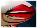
So... you were at this trip-hop club with the blacklights and someone wearing really bad camo-fleece was attacked by a rabid monkey... and this is the best you could do?
FOCUS!!! I don't even know what I'm looking at. If you insist on doing somersaults while shooting at least use a faster shutter speed. It looks like you have effectively done everything you could possibly do wrong with a Lens Baby to make the worst photo possible with it AND YOU WEREN'T EVEN USING ONE. So kudos on that.
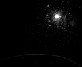
The lighting seems pretty uneven, which would be ok if it was used to enhance the subject of the photo but as far as I can tell there is no subject.
One could try and argue this is "Art" but clearly it does not fit into the strict guidelines of what would be considered "Art" and therefore I'm afraid it must be rejected.
One could try and argue this is "Art" but clearly it does not fit into the strict guidelines of what would be considered "Art" and therefore I'm afraid it must be rejected.