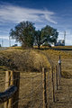
It came in about where I had hoped and anticipated. However, when editing, I was trying to get some of that wow-factor or a unique look to it and didn't quite get what I was hoping for in that regard. I was wondering if anyone else might be interested in having a crack at it and telling me how you did whatever you do with it. I've uploaded to my workshop a copy of what came out of my raw converter, at a size of 1280 pixels tall and about 350k in size. Thanks.
I will take a shot at it tonight. Certainly has a good deal of potential. Not sure how well I will do with it, but I'm sure someone can, although yours isnt all that bad honestly.
Here is a quick edit, mainly just added some dodging and Burning on a new layer created as soft light at 50% gray suing a technique learned in one of the sites tutorials. Then converted to B&W using channels and adjusted for preference then bumped contrast slightly.
I'd clone away all the buiilding/signs on the right and just leave the horse. This is propably too much cloning for the challenge rules, but as far as a photo hanging on your wall this is what is need to make it "pop" As it is, I did not even notice to horse for a while as the other junk is a distraction.
I agree with the other commenters...and use dodge and burn/vignette to bring the subject out. It's tough at 720 pixels to have this composition work otherwise.
I agree with the other commenters...and use dodge and burn/vignette to bring the subject out. It's tough at 720 pixels to have this composition work otherwise.
Here's a quick and very dirty pass:
No need for me to try an edit. This tops anything I could have done and seems like where I would have gone with it. If I had PS skills that is.
Ok, here's a different take. I decided to focus on keeping this a color image, though I had some interesting B/W also. There's something about the color that appeals... I made no attempt to alter the image by cropping or cloning, and not sure if I'd want to; all those details, to me, are part of the earthy ambience of the image, and I don't think any changes along those lines can turn it into anything approaching a great, "classic" landscape anyway. Processing notes as follows (also posted in comments):
From RAW, 9 layers. Opened and adjusted in ACR, exported to CS3, Topaz Adjust on the Clarity setting, Topaz Denoise on the sky only, Levels on the sky, Multiply overlay with gradients top and bottom, Hue/Sat separately on sky and foreground, B/W adjustment layer customized off yellow preset, B/W layer faded to 25% in soft light mode, resize.
Here is my edit.
I found that there really wasn't a focus on this pic. I found it hard to get a good crop to put an emphasis on something. So I went with the trees. The fence leads right to them So I made them the focus.
I cloned out the power lines on both sides, Tweaked levels,curves,Convert to b/W add a very slight tint on the blue side, Dodge,Burn sharpen and cropped.
Thanks for all the edits. This was quite educational. It's always interesting to see what different people do with the same source. Bear_Music's edit was actually very close to what I had in mind but was unable to achieve. (He asked for the RAW to work from, so he did have more original data than anyone else) I have a few things to experiment with and learn.
Here is my edit.
I found that there really wasn't a focus on this pic. I found it hard to get a good crop to put an emphasis on something. So I went with the trees. The fence leads right to them So I made them the focus.
I cloned out the power lines on both sides, Tweaked levels,curves,Convert to b/W add a very slight tint on the blue side, Dodge,Burn sharpen and cropped.
Woa! Great work! Gave a lot of beauty to the tree in my opinion!