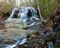
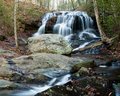
I would like comments and suggestions for improvement on this image. My son says it is not one of my best because of the "decay" (actually a stream bank) on the right.
I agree with your son, the bank at the right side of the stream doesn't add anything to the image, you should just crop it out. I would leave the bottom bit though, the brown leaves on the rock are nice.
Might also be useful to increase the contrast a bit, or apply a curves adjustment to get a little more out of the colours and enhance the water.
I prefer the framing of the first shot (without the right side) but the adjustments on the second shot :) I am viewing on a laptop screen mind you, so the colours may look a little different to me.
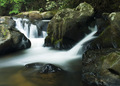
Saying that, (and at the risk of getting sidetracked) I've just had a look at your portfolio and your nature shots in general are very good, I particularly like this one: