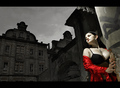
Tagging along with a recent forum thread ("Time to get rid of borders?") what do you think of the recent rise of using TOP/BOTTOM THICK BORDERS? DPC homepage currently carries 3 of 9 ribbon winners with this border design. Look back a few months and you'll find just nine winners out of 159 using the Top/Bottom Border, just 5% of ribbon winners.
As far as I can tell, we have yet to see a "portrait" layout photo that uses a LEFT-SIDE/RIGHT-SIDE THICK BLACK BORDER. Who will be the first to ribbon with such a "radical" border design? Be the first kid on your block to go THICKBLACKBORDERONTWOSIDESONLY. Join the growing DPC fad of surrounding your photos with thick bushy eyebrows. Black facial photo hair is in this winter.
My own view of this Top/Bottom Thick Black Border is three-fold:
1) The TOP/BOTTOM border draws a lot of attention to itself, simply because it is unusual, seldom found in framing in the whole history of art/photographic framing (as far as I have seen at least).
2) IMHO, the THICK BLACK border acts as a vise-grip, seeming to squeeze the frame of the photo, forcing a narrowing of the photo upon the viewer.
3) Judging from the 30% success rate on the current homepage, the TOP/BOTTOM THICK BLACK border may be your ticket into ribbonland.
I use the wide top and bottom border quite a bit and I like it for some images. Get criticised for it too...
It's got you a few ribbons too Enzo! Though it may have a little to do with the actual photos, can't make a silk purse from a sows ear, its hasn't worked so well for mine in the past :)
I use the wide top and bottom border quite a bit and I like it for some images. Get criticised for it too...
It's got you a few ribbons too Enzo! Though it may have a little to do with the actual photos, can't make a silk purse from a sows ear, its hasn't worked so well for mine in the past :)
I use the wide top and bottom border quite a bit and I like it for some images. Get criticized for it too...
ditto... and double ditto b/c I got the idea from you! :P ... I use it to 'square up' for Panorama type shots that would otherwise look awkward (IMO) as they don't have a lot of pixels in them and the grey dpc background distracts from them.
After awhile, it will turn into a cliche as people add it to almost any image they produce, and it will do more harm than good to the scores, from that day forward.
Tagging along with a recent forum thread ("Time to get rid of borders?") what do you think of the recent rise of using TOP/BOTTOM THICK BORDERS? DPC homepage currently carries 3 of 9 ribbon winners with this border design. Look back a few months and you'll find just nine winners out of 159 using the Top/Bottom Border, just 5% of ribbon winners.
As far as I can tell, we have yet to see a "portrait" layout photo that uses a LEFT-SIDE/RIGHT-SIDE THICK BLACK BORDER. Who will be the first to ribbon with such a "radical" border design? Be the first kid on your block to go THICKBLACKBORDERONTWOSIDESONLY. Join the growing DPC fad of surrounding your photos with thick bushy eyebrows. Black facial photo hair is in this winter.
My own view of this Top/Bottom Thick Black Border is three-fold:
1) The TOP/BOTTOM border draws a lot of attention to itself, simply because it is unusual, seldom found in framing in the whole history of art/photographic framing (as far as I have seen at least).
2) IMHO, the THICK BLACK border acts as a vise-grip, seeming to squeeze the frame of the photo, forcing a narrowing of the photo upon the viewer.
3) Judging from the 30% success rate on the current homepage, the TOP/BOTTOM THICK BLACK border may be your ticket into ribbonland.
:)
I added a left/right thick border to my portrait oriented entry and then removed it as it looked too odd :)
... I use it to 'square up' for Panorama type shots that would otherwise look awkward (IMO) as they don't have a lot of pixels in them and the grey dpc background distracts from them.
Wouldn't it be nice to have the option to display your challenge entry on a black DPC background? White sometimes too. Make it a user choice when submitting a challenge entry.
... I use it to 'square up' for Panorama type shots that would otherwise look awkward (IMO) as they don't have a lot of pixels in them and the grey dpc background distracts from them.
Wouldn't it be nice to have the option to display your challenge entry on a black DPC background? White sometimes too. Make it a user choice when submitting a challenge entry.
... I use it to 'square up' for Panorama type shots that would otherwise look awkward (IMO) as they don't have a lot of pixels in them and the grey dpc background distracts from them.
Wouldn't it be nice to have the option to display your challenge entry on a black DPC background? White sometimes too. Make it a user choice when submitting a challenge entry.
... I use it to 'square up' for Panorama type shots that would otherwise look awkward (IMO) as they don't have a lot of pixels in them and the grey dpc background distracts from them.
Wouldn't it be nice to have the option to display your challenge entry on a black DPC background? White sometimes too. Make it a user choice when submitting a challenge entry.
... I use it to 'square up' for Panorama type shots that would otherwise look awkward (IMO) as they don't have a lot of pixels in them and the grey dpc background distracts from them.
Wouldn't it be nice to have the option to display your challenge entry on a black DPC background? White sometimes too. Make it a user choice when submitting a challenge entry.
Be the first kid on your block to go THICKBLACKBORDERONTWOSIDESONLY. Join the growing DPC fad of surrounding your photos with thick bushy eyebrows. Black facial photo hair is in this winter.
yanko went one step further and gave us a thick on only one side border. He did, however, get DQ'd for his troubles.
only two times so far that i used one as you describe it:
this one looked weird without any border bottom/top.
and this one won me my first ribbon, i think it really works here because the elements at the top and bottom of the image are cropped, so it's good to have something that holds the compostion together, plus it was the movie titles challenge, so the choice was quite obvious.