|
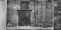
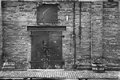
Second one works best for me. The blank space around the first is distracting, and unless you are familiar with negatives, it might not be self evident as to what the viewer is looking at. If there were more than one frame in your image, (ie. two or three) then the message would come across more quickly. As is it looks like the partial second frame is really part of the first, cut off for no good reason and then moved over a bit. You have to stop and look at the text on the negative to see what is going on. |