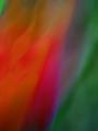
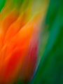
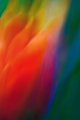
I am going through and producing canvas prints of my more painterly works, and I went back to revisit one of the first motion abstract I produced (well, at least the first one I felt was "successful").
I liked it, and started to produce a different crop for DPCPrints, so I focused on getting it a little closer to the original. But then I ended up enhancing it even more.
Which do you like better and why? Thanks in advance for your feedback!
Original DPC Version
Version produced for Canvas Print
Further enhancement and recrop for DPCPrints
Note that in the new editing, I have worked to enhance various colors present in the original. But I haven't actually pixel edited anywhere (other than using layers to bring out areas of color without affecting the entire photo).
Well,I like the version produced for canvas print the best. It is much brighter and the more green on the right adds perspective and depth and seems to balance the photo better. Will make a very nice print.
I do like the more blue in the orig. version though.
I'll go on record as preferring the original. It's a LOT more subtle. Your new emphasis on the yellow in the other versions seems misplaced to me. The one with the bright blue I consider to be horrible, what are blue/yellow doing battling on this subtle red BG?
I think I prefer the canvas version. It has stronger and more eye catching colors, but the shading is still smooth. It's a close call though, and the adjustments give them very different looks.
personally, i like the more vibrant colors of the canvas print, the oranges, reds and greens are more dynamic, the purple hues seen in the original are gone, giving this a bit more cheery feel. the crop of the dpc crop really doesn't work for me as well, and i am not a big fan of the large blue swatch in the lower section of the photo