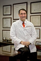
I did a shoot for a doctor recently and I'm having trouble with the editing. I'm not even entirely sure why, but I'm just not happy with the outcome (the photos themselves, I think are OK, but the finished product just somehow seems to be lacking). I would love for some people here to take a look and let me know what you think is still wrong.
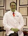
I just cropped tighter, did a quick dodge of the eyes and played with brightness and contrast a little. I think it needs a tighter crop because he has a nice face. Also seems to be to busy a background.
[thumb]698587[/thumb]
Thanks smichener, I do like the cropping idea.
Thanks so much for your help too Sugarpie, but could you post what you did as well?
Thanks guys!
Anyone else?
ok I am really bad at explaining stuff like this so here is my version and Im sure someone couldve made it shorter
first i selected his face and desaturated it JUST A TINY BIT to get the red off his face and give him more natural lookin skin (unless he really is that red then I apologize)
I used the select wand tool thing, (I told you i was bad!) feathered it 15pixels, selected about 15 pixels away from his body, in other words I outlined him, then I selected the inverse ( i feel nooby now) and did a curves adjustment to make it a little bit darker, to make him stand out, then I blurred it, then I selected him again desaturated JUST A BIT! a tiny bit of contrast/brightness, selective colouring and tada
I apologize if this sounds like a ramble...or if it doesnt make sense
- crop
- image /apply image / soft light on red channel
- opened again with RAW-editor, added a small (ahum) vignette (I'm a little bit into the vignettes lately ;))
- some curves
Edit: ok, the vignette could've been a bit smaller and a BIT more subtle, but it was still set on a particular model-photo. But you get the point I think ;)
Edit: next time ask him to iron his shirt and shave his face *lol*
[thumb]698609[/thumb]
First thing I did is remove lines below nostrils. Burn tool at 10% around mouth and eyes. Hue- Saturation, Red -25, Yellow and green +11 for skin tone. Sponge tool- saturation 10% to put color back into lips. 2 percent rotation to the left and crop. Sharpen-resize-sharpen, save for the web.
Here's my take on it. Something has come up so I have to run for a bit, I'll come back later with steps used:
Okay, back.
You have several problems here.
1. By far the biggest problem is that the face is nowhere NEAR being in focus. There's nothing more to be done about that than what I have done in this version with Focus magic plugin.
2. You have lighting issues, the lighting on his face is just plain funky and "unnatural". I have done a little dodge and a little burn on a separate, soft light overlay layer filled with 50% gray to work on that.
3. You have color cast issues. This is a REAL problem. When we see doctors in white coats, we *demand* that those white coast BE white, ya know? This dirty yellow coloring isn't going to pass muster. I used "match Color" in the "neutralize" setting, faded back to about 48% with the vibrance amped up and the saturation turned down a little.
4. The whole image is slightly out of kilter. I used the skew tool before cropping to square up the frames to the image edge.
6. Overall luminance balance between foreground and BG was adjusted with shadow/highlight, one of the first things I did.
7. I opened a new, empty layer set to multiply mode and filled with white, then used the vignette tool in "filters/distort/lens correction" to darken the corners a bit.
2. You have lighting issues, the lighting on his face is just plain funky and "unnatural". I have done a little dodge and a little burn on a separate, soft light overlay layer filled with 50% gray to work on that.
Interesting. What does this do exactly? Why not just dodge/burn the image? When, in general, do you employ this strategy (dodging/burning a gray layer in some blending mode)?
Here's my take on it. Something has come up so I have to run for a bit, I'll come back later with steps used:
Okay, back.
You have several problems here.
1. By far the biggest problem is that the face is nowhere NEAR being in focus. There's nothing more to be done about that than what I have done in this version with Focus magic plugin.
2. You have lighting issues, the lighting on his face is just plain funky and "unnatural". I have done a little dodge and a little burn on a separate, soft light overlay layer filled with 50% gray to work on that.
3. You have color cast issues. This is a REAL problem. When we see doctors in white coats, we *demand* that those white coast BE white, ya know? This dirty yellow coloring isn't going to pass muster. I used "match Color" in the "neutralize" setting, faded back to about 48% with the vibrance amped up and the saturation turned down a little.
4. The whole image is slightly out of kilter. I used the skew tool before cropping to square up the frames to the image edge.
6. Overall luminance balance between foreground and BG was adjusted with shadow/highlight, one of the first things I did.
7. I opened a new, empty layer set to multiply mode and filled with white, then used the vignette tool in "filters/distort/lens correction" to darken the corners a bit.
Thank you guys for all your help. And although Dirt_Diver's efforts were clearly best (hehe), it was really helpful to have all your fresh eyes and opinions.
2. You have lighting issues, the lighting on his face is just plain funky and "unnatural". I have done a little dodge and a little burn on a separate, soft light overlay layer filled with 50% gray to work on that.
Interesting. What does this do exactly? Why not just dodge/burn the image? When, in general, do you employ this strategy (dodging/burning a gray layer in some blending mode)?
Looks really good.
It's non-destructive, basically. You can toss the whole layer and start over again. Plus, since it's on a layer, you can change blending modes, which can have interesting effects.
2. You have lighting issues, the lighting on his face is just plain funky and "unnatural". I have done a little dodge and a little burn on a separate, soft light overlay layer filled with 50% gray to work on that.
Interesting. What does this do exactly? Why not just dodge/burn the image? When, in general, do you employ this strategy (dodging/burning a gray layer in some blending mode)?
Looks really good.
It's non-destructive, basically. You can toss the whole layer and start over again. Plus, since it's on a layer, you can change blending modes, which can have interesting effects.
R.
Thanks Robert (Bear). I just tried it. I also like that you can "see where you've been," so to speak. I used it to brighten up some butts in this image:
Thanks Robert (Bear). I just tried it. I also like that you can "see where you've been," so to speak. I used it to brighten up some butts in this image:
That's cool. And you can change the blend mode for different effects as well. Overlay vs Soft Light is the most common change; overlay is more aggressive, soft light mutes the effect somewhat.