As for your two entries, I do like the second one a lot too...
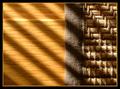
Since the challenge is now over, I wonder how the second would look if you corrected the perspective shift? I know this can be done in photoshop, have no idea if it can be done in other packages.
I prefer the first because it is bolder, but I think it could be improved by placing the window off-centre in the picture. It's probably just me, but I would prefer the verticals of the window to be vertical within the picture.
My outtakes are pretty much covered by my gallery for the recent DPC London get together which is here
cbonsall- If it was the advance challenge and you were able to correct the perspective I probably would've scored it higher. Maybe you should fix it and make it a print, kind of an interesting view.
peecee- The second one has a better point of focus, the converging lines into the corner.
GeneralE- I did like the different subject of the carts and gave it a "7" but the alternate "Monorail" would've probably given out a "9".
I didn't enter this shot specifically because it lacked anything unique that would survive the "somebody else's kid" votes. I do think the angle was rather interesting though. I'm sure it wouldn't have fared as well as my birdcage entry, but I'd like to know how others would have scored it for future reference. How about that discrimminating photo critic that gave the birdcage a 1- would this have merited a 2 by your lofty standards? ;-)
cbonsall - I think the one window is better, it gives you a focus.
peecee - I like the second one better because it is more balanced than the one you entered. You'd have to crop out the bright light on the bottom and brighten/contrast it more, but that's my pick.
GeneralE - Not your entry but the first alternate. It's a lot cleaner and the color is better.
It's probably a good thing I entered the one I did because I think allot of voters missed all the parallel lines I purposed placed in the picture and focused mainly on the shadows so they would have really missed the lines in the alternate picture. The alternate entry had allot of lines also but I figured it would be missed by the voters.
I want to use this picture but it was taken on the 7th, three days before the challenge began. I wanted to go back to the same place but it snowed & I punked out.
The one I did enter, I wish I had never entered. My scored were doing so good & then I went & entered a shot I didnt like. Why o' why? Never gonna do that again!
Cbonsall: I prefer the one you entered, but with window off-centered. You could have rotated the image under basic editing to get the window sides vertical.
Kavey: Pillars II would be my pick by far. The long, off-center hallway provides better depth and interest (and there's little for voters to criticize). The shot you entered was hurt by the unfocused foreground pillars, and I would have liked to see a color version of that one. Locking the exposure on a brighter area (the sky) would have captured the clouds. All good shots, though.
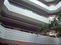
PeeCee: I prefer your entry and gave it a 7. It would have been better IMO without the tree, but management probably wouldn't appreciate your use of a chainsaw. The shadows and warm light of late afternoon might have drawn more interest.
GeneralE: Mono-Rails is my pick- maybe with the color puched up a bit. Yes, there are plenty of parallel lines in your entry, but shopping carts just aren't all that appealing. The third shot is tough to make out even with your explanation.
Orussell: Great concept on your entry (I took a peek in the oven, too). I like the focus on the kink, but some don't appreciate shallow DOF. I think you might have improved the shot by simply cropping out the corner on the bottom- just straight lines with one kink.
Ami Yuy: Lots of outtakes- you obviously worked hard on this one. You made the right choice, too. It's hard to make an appealling shot with a subject like this. You'd need a really deep blue sky or sunset to push it over the edge. I think you could adjust the blue channel under basic rules to get that rich blue (I've seen others make similar adjustments).
BrennanOB: Hard to judge from just a thumbnail, but it looks like you would have scored well- 6 to 6.5.
K-Rob: Tough call. Probably the one you entered. All the technical aspects and composition are fine as your commenters have said (although the blinds seemed a little contrived to me). The limiting factor here is the relatively bland subject. Don't get me wrong, your score is proof enough that it's a good photo, but the ribbon winners tend to have some extra twist or quality to make them frame-worthy.
BTW- I see kavey, orussell, GeneralE and faidoi often in comments and forums (and moodville, justine, KarenB, jporchard, sfalice...). Your active participation is much appreciated.
K-Rob: Tough call. Probably the one you entered. All the technical aspects and composition are fine as your commenters have said (although the blinds seemed a little contrived to me). The limiting factor here is the relatively bland subject. Don't get me wrong, your score is proof enough that it's a good photo, but the ribbon winners tend to have some extra twist or quality to make them frame-worthy.
Thank you very much for your point of view on my and everyone else's pictures. It must have taken some time to go through all of that. VERY much appreciated.
Cbonsall: I prefer the one you entered, but with window off-centered. You could have rotated the image under basic editing to get the window sides vertical.
Kavey: Pillars II would be my pick by far. The long, off-center hallway provides better depth and interest (and there's little for voters to criticize). The shot you entered was hurt by the unfocused foreground pillars, and I would have liked to see a color version of that one. Locking the exposure on a brighter area (the sky) would have captured the clouds. All good shots, though.
PeeCee: I prefer your entry and gave it a 7. It would have been better IMO without the tree, but management probably wouldn't appreciate your use of a chainsaw. The shadows and warm light of late afternoon might have drawn more interest.
GeneralE: Mono-Rails is my pick- maybe with the color puched up a bit. Yes, there are plenty of parallel lines in your entry, but shopping carts just aren't all that appealing. The third shot is tough to make out even with your explanation.
Orussell: Great concept on your entry (I took a peek in the oven, too). I like the focus on the kink, but some don't appreciate shallow DOF. I think you might have improved the shot by simply cropping out the corner on the bottom- just straight lines with one kink.
Ami Yuy: Lots of outtakes- you obviously worked hard on this one. You made the right choice, too. It's hard to make an appealling shot with a subject like this. You'd need a really deep blue sky or sunset to push it over the edge. I think you could adjust the blue channel under basic rules to get that rich blue (I've seen others make similar adjustments).
BrennanOB: Hard to judge from just a thumbnail, but it looks like you would have scored well- 6 to 6.5.
K-Rob: Tough call. Probably the one you entered. All the technical aspects and composition are fine as your commenters have said (although the blinds seemed a little contrived to me). The limiting factor here is the relatively bland subject. Don't get me wrong, your score is proof enough that it's a good photo, but the ribbon winners tend to have some extra twist or quality to make them frame-worthy.
BTW- I see kavey, orussell, GeneralE and faidoi often in comments and forums (and moodville, justine, KarenB, jporchard, sfalice...). Your active participation is much appreciated.
Thanks Shannon for taking the time to make those comments.
I'm making up for the comments I didn't leave during the challenge [hiding under the desk in shame]...
Rooster: None of the above. I liked your laser shots better. The shallow DOF and bright spot on the Frosted Bars pic hurt you. Using a smaller aperture to get all the snow in focus and blocking (or at least moving) the bright spot would have helped a lot IMHO.
banmorn: Your first outtake is the pick of the litter. The arms in your entered shot weren't strong enough as elements to make the parallel aspect obvious. They're elements that happen to be parallel, but they don't play a lead role in your photo. Logan Two Parallels, on the other hand, is all about parallel and the subtle color variations create an interesting effect that makes it hard to tell if this is one building or more. It's almost a puzzle for the viewer to solve. The diagonal composition on your last outtake is interesting, too, but interesecting lines on that one are almost as strong as the parallels.
Thanks K-RoB and Shannon for the input....I appreciate it. I think you are definitely right about the entered shot. Trouble was, I saw the statue and the shadow and the light and said WoW!...so I went with it. I do architectural abstracts ALL the time and the Lines Lines Lines were just getting to me......Thanks again....I gotta run....seems that someone is offering 'Decorative Tulips' as an email tag without my permission and I've got to see what that is all about.....GRRRRRRRRRRR!
I'm making up for the comments I didn't leave during the challenge [hiding under the desk in shame]...
Rooster: None of the above. I liked your laser shots better. The shallow DOF and bright spot on the Frosted Bars pic hurt you. Using a smaller aperture to get all the snow in focus and blocking (or at least moving) the bright spot would have helped a lot IMHO.
banmorn: Your first outtake is the pick of the litter. The arms in your entered shot weren't strong enough as elements to make the parallel aspect obvious. They're elements that happen to be parallel, but they don't play a lead role in your photo. Logan Two Parallels, on the other hand, is all about parallel and the subtle color variations create an interesting effect that makes it hard to tell if this is one building or more. It's almost a puzzle for the viewer to solve. The diagonal composition on your last outtake is interesting, too, but interesecting lines on that one are almost as strong as the parallels.