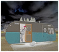
It's quirky and amusing and one of my high scores. But it probably suffered with the voters for a couple reasons:
1. There's no wow factor here, technically, conceptually, or compositionally.
2. Looked at with a critical eye, ignoring the reverse entirely, it's really a pretty blah composition. The trees sprouting from the roof seem accidental, the roof itself pretty much bisects the image, the lighting is pretty flat on the subject, and so forth.
Balancing all of that, in MY opinion, is a pretty cool "reversal" on the slice-of-life-snapshot theme.
I just don't find it interesting, either in colour, composition or tone/lighting. It looks a bit like a snapshot. There seems to be a lot of detail missing too. Does it looks better when it's not negative?
Sorry to sound harsh but you wanted feedback.
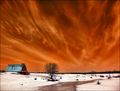
On the flipside, some of your other stuff is awesome, especially this!
That looks much better, clearer and sharper! Have a look through the negative challenge shots, not many of them are amazing, it takes a lot to make a negative look really pleasing to the human eye, as we try to reverse it.
Well, i would have given it a 4... it does nothing for me. It looks just like any old random shot you decided to invert the colours of, not for any reason, but because it was a challenge that called for it.
The composition is average, the colours the same. I think to win, or be in the top 20 at least, a picture needs some kind of factor that makes you stop and look and appreciate it, and make me wish I thought of it and did the same thing... as it stands, it looks like someone took a snapshot of their friend in a caravan door, which would work great for a scrapbook, or an album or a facebook picture, but not on DPC.
Sorry if that seemed abrasive but i try not to pull punches when people ask these kind of questions.