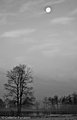
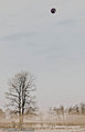
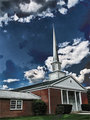
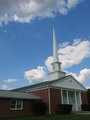
DIFFERENCE: As the name infers, this mode looks at the differences between pixels of the top and bottom layers. Large differences will lighten, small differences will darken. ( From the November 2007 issue of Photography Monthly)
A more thorough definition can be found in a number of books. The following is from Adobe Photoshop CS2 for Photographers.
Subtracts the base colour from the blending colour or vice versa depending on whichever has the highest brightness value. If one of the colours is black (value 0) then the brighter colour will appear in the blended image. The colour of the blended image depends on the brightness value of the blended image.
Though strange and wonderful results can be achieved with this blending mode (see cow images in my portfolio), a practical use is for determining alignment of images of the same scene. Using difference mode on two layers with the same image will produce a completely black image. However, areas that are out of alignment will show some colour.
EXCLUSION: More subtle version of difference. Lighter the pixels in the top layer the stronger the effect.
If the top image is pure white then the effect of exclusion will be to completely invert the base image.
Exercise 1:
Take any picture
Duplicate the background
Change the blending mode of the duplicate background to difference
Your image should now be completely black.
You might be saying wtf?
The values in the bottom layer were subtracted from the values in the top layer. Since both layers contain the same image the resulting values are 0,0,0 which is black.
WEEK TWO
Let's play with the darkening blending modes: Darken, Multiply, Colour Burn, Linear Burn
Definitions:
Darken - looks at the two colors, the color already there, and the one you’re painting with, and chooses the darker one, whichever it is. No blending. Whichever is darker wins. Which of the two is used will vary across the image according to which is darker at each spot. This is all done based on the channel.
Multiply - multiplies the base color with the blend color. Clearly the resulting color will be darker. Black times any color equals black. White times any color leaves that color unchanged. Light colors have less effect, dark colors have more effect. Repeated strokes with this blend mode produce darker and darker colors.
Color Burn - supposed to be the opposite of Color Dodge. What it looks like is, the color applied to light areas is unchanged by the underlying colors, while color applied to darker areas is dramatically darkened.
Linear Burn - Uses the color data from each channel,“darkens the base color to reflect the blend color by decreasing the brightness”
WEEK THREE
Let's play with the lightening blending modes: Lighten, Screen, Colour Dodge, Linear Dodge
Definitions:
Lighten - As the new color is applied, if it’s lighter than the color already there, it replaces that color. If it’s darker than the color that’s already there, it is not added.
Screen - Just think of it as making the light parts a lot lighter, the dark parts a little bit lighter, leaves the black parts unchanged, and nothing gets any darker. This is done on a channel by channel basis.
Color Dodge - It looks like the color applied to light areas is bright, but pale, and the color applied to dark areas is barely visible.
Linear Dodge - The inverse of Linear Burn. Uses the color information from each channel to brighten the base color according to the blend color.
WEEK FOUR
Hue - uses the hue (color) that you’re adding (the blend color), but the luminance (brightness) and saturation (richness) of the base color (the color already there).
Saturation - just like hue, but this time the saturation (richness, depth) of the new color is used, while the luminance (brightness or darkness) and hue (color) of the original image are used.
Color - the result of this blend has the luminance (brightness or darkness) of the base or original color, but the hue (color), and saturation (richness) of the new, or blend color. This blend mode is commonly used for colorizing black and white images.
Luminosity - uses only the luminance (brightness or darkness) values of the new or blend color. All hue, and saturation values of the blend color are ignored. This is a useful mode to choose when using the Sharpen tool.
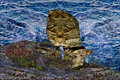
The cow takes on the texture, colour and detail of the overlayed image since it is black, black being 0,0,0. Most of the cow is very close to this.
The more I glance between the cliff image and the blended image the more I see where the blended image is getting its content from, like the collar and snout of the cow. Both areas are dark in both images so they remain dark in the resulting image.
One way to examine images is to have both in normal (or even have the top layer already changed to difference) mode but change the opacity of the top layer so you can see through to the bottom.
I'm still unsure. So each week, we pick a certain mode and then we all use it with various opacities, and explain it?? (I'm dense) haha
In photoshop, blending modes are grouped by what they do in general, darken, lighten etc. Each week I'll pick a new set of modes and post the definition. I'll try and show an example and explain what is happening when the images are merged.
Your assignment is to try and find images that work well with the week's blending modes and based on definition and analysis of the images being blended try and explain what is happening. Easier said than done. We're all here to help though so post whatever questions you have and if you have images related to the questions that's even better.
Take any picture
Duplicate the background
Change the blending mode of the duplicate background to difference
Your image should now be completely black.
You might be saying wtf?
The values in the bottom layer were subtracted from the values in the top layer. Since both layers contain the same image the resulting values are 0,0,0 which is black.
I would like to join in. Since I'm moving Mar. 22, I may not be able to keep up. But I will try! This is a fascinating subject, with many interesting possibilities.
I would like to join in. Since I'm moving Mar. 22, I may not be able to keep up. But I will try! This is a fascinating subject, with many interesting possibilities.
A few hours early, but here's my exercise 1 [thumb]653002[/thumb]
And what I did with the difference mode.
I took one picture of me on a solid black background [thumb]652946[/thumb] (with some minor editing)
then added a new layer of a picture of tree bark [thumb]652945[/thumb]
Set the bark to Difference mode, and did a touch of erasing around me, to let the darker areas of my hair and clothes show through, then I lowered the opacity of the differenced bark just a tad to make it look more like the background... and viola`
[thumb]652944[/thumb] Now I'm in a cave of some sort about to be gotten by something shiny :)
Exactly. The exercise was to give an easy illustration of what difference does.
I like your rendition of a cave.
Now this doesn't mean you have to start with black. Black is just the easiest to work with to know what the result will be since it will always be what is in the overlayed image. Experimenting with not so black colours leads to some interesting colours.
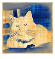
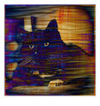
I too am getting a jump on the week, as I might not have time later. I fiddled with both the difference and the exclusion overlay modes.
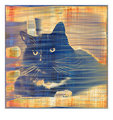
this is the final image:
and this is how I got there:
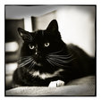
I started off with this cat
and added a texture from flickr in difference mode at 100%, to produce this:
then added ErinM's texture in exclusion mode at 100%, which by itself looks like this:
with the two overlays together, with ErinM's texture above the other texture in the stack, the shot becomes the "final image" noted at the top of this post
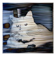
for kicks, this is what the shot looks like with both textures, but with ErinM's texture below the other texture in the stack:
so you can see layer order can make quite a bit of difference!
You guys have hooked me. So I guess I'm in. I'll have to see how much time I get to work on this, so I'll do what I can. But given the images and the discussion I could not help but go experiment.
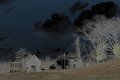
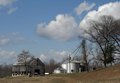
I took the original image and overlaid it with the same image converted to black and white. The difference overlay ended up very dark. So I played around with the lighting on the two. Mainly I lightened the original so that it was very much overexposed. I probably went too far. I suspect that I can play more with the two images lightening one and darkening the other to get a wide variation it what the final merged image looks like. This was a good learning experiment.
If you overlay an image with itself and use difference it will turn completely black.
If you overlay an image with a layer of white you will get a perfect negative of your image.
Using exclusion you will get a more subdued result.
Also, it matters which image is on the bottom. Though the closer the tonal values are in each image the less of a difference you will see.
Thinking about how this blending mode works on the two images will help you decide which image should be on the bottom and which one on top for the result you are trying to achieve.
While in the "Words and Illustrations" thread I've been using this set of Blending Modes exclusively,
this is the first one I've done specifically for this side-challenge. I was out this morning taking
pictures of the beautiful flowering ornamental plums that are all over San Francisco right now.
the original: [thumb]653434[/thumb]
i made a copy of the original for Layer One, and used "Exclusion" on it: [thumb]653433[/thumb]
I made another copy of the original, Layer Two, and used "Difference" at 73% [thumb]653432[/thumb]
I really liked this effect, flattened it and call it complete at this point.