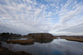
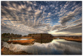
For those who are interested, here's a before-and-after on my "River" entry:
Bear in mind that the "before is a completely unprocessed RAW image, zero contrast, saturation, sharpness etc. The actual scene had somewhat more luminance than that, but still... The processed image is what i was seeing in my mind's eye. The processing details are in the photographer's comments section of that image.
For what it's worth, I could have pulled essentially the same image, in this case, off a single RAW exposure without combining multiple images; the actual tonal range of the scene is not that extreme.
I'm expecting this thread to generate some comments along the lines of how this image is "fake" because it doesn't approximate the "reality" of the scene, but I can live with that :-)
I've said this before, but the great gift you deliver is in showing us what's possible, Robert. I know that my editing skills have progressed primarily because I started to, as you put it, see a better-looking finished image in my mind's eye even given what looks like a bland initial photo.
I've said this before, but the great gift you deliver is in showing us what's possible, Robert. I know that my editing skills have progressed primarily because I started to, as you put it, see a better-looking finished image in my mind's eye even given what looks like a bland initial photo.
Well, that was Ansel's gift to me; I'm happy I could pass it on. It's what he's talking about when he discusses "previsualization".
Bear if I am stepping on your toes let me know and I will take this image down. I am not a big fan of HDR although I did think your photo was very dramatic looking, especially the sky. Here is what I did in a few seconds in PSP. Almost (but not not quite) the same results, for anyone who doesn't do HDR.
[thumb]636321[/thumb]
In PSP 7:
-clarify 3 times at strength 5
-saturation
-adjust colour so there is less blue
But...it does. What people don't understand is that everything in your photo is there, actually there. 10 different people will see the image 10 different different ways.
You photo shows how everyone will see it. Certainly not fake.
Nice job on you entry!!
Originally posted by Bear_Music:
I'm expecting this thread to generate some comments along the lines of how this image is "fake" because it doesn't approximate the "reality" of the scene, but I can live with that :-)
Bear if I am stepping on your toes let me know and I will take this image down. I am not a big fan of HDR although I did think your photo was very dramatic looking, especially the sky. Here is what I did in a few seconds in PSP. Almost (but not not quite) the same results, for anyone who doesn't do HDR.
[thumb]636321[/thumb]
In PSP 7:
-clarify 3 times at strength 5
-saturation
-adjust colour so there is less blue
No, that's actually a good illustration of the difference between conventional PP and HDRI/tone mapping. As I pointed out, the image didn't HAVE to be processed with HDRI to pick up the inherent drama, as the necessary information was all in the single capture. And anyone with CS2 or CS3 can get an even closer approximation by following your route and using shadow/highlight at some point in the process.
What HDRI/tone mapping is allowing us to accomplish is to increase local area contrast without blocking up the deeper parts of the shadows, so the overall effect is more muted but the power and drama still comes through.
The key step here is actually the previsualization, the realization that the drab original does contain the seeds of an image like this. I suspect a lot of people would look at the original capture and pass right over it, thinking it would never be more than a snapshot, so to speak.
I had a similar experience last year. I Entered this in the Best of 2006
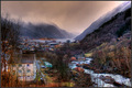
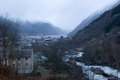
Here's the original
As you said, in my mind's eye I remember the tone mapped image more than the raw capture. Tone mapping helped me to realize in a photo what I saw while shooting.
Many time we capture images that at first glance don't represent what we saw. "You had to be there" kind of thing. This technique, at least in some instances, enables us to realize the images that otherwise would have been passed over.
One thing I notice often in these tonemapped landscapes is the colors are always unnatural looking. Do you guys find it difficult to preserve the original color base without there being a shift due to the tonemapping applied? Don't get me wrong, I like color experimentation and did just that with my entry but that was by design using curves and not the results of having to fix what photomatix or some filter did.
One thing I notice often in these tonemapped landscapes is the colors are always unnatural looking. Do you guys find it difficult to preserve the original color base without there being a shift due to the tonemapping applied? Don't get me wrong, I like color experimentation and did just that with my entry but that was by design using curves and not the results of having to fix what photomatix or some filter did.
Not usually, no, not very much. Photomatix gives pretty good color saturation control. In this case, I had to tone down the yellow/red a little bit, but this is because I amped up saturation to grab the blue in the sky. I liken it to PS hue/saturation: if you bump global saturation, you may have to go back and tune down some local channel saturation. So in this shot, I used Photomatix to "set" the sky and used hue/sat to tone down the grasses. They are as bright as they are because I wanted them to be; I had other versions where they were much more muted and this didn't work as well compositionally.
R.
ETA: I notice a real tendency for most people to oversaturate greens in tone mapping, and this bothers me...
Bear if I am stepping on your toes let me know and I will take this image down. I am not a big fan of HDR although I did think your photo was very dramatic looking, especially the sky. Here is what I did in a few seconds in PSP. Almost (but not not quite) the same results, for anyone who doesn't do HDR.
[thumb]636321[/thumb]
In PSP 7:
-clarify 3 times at strength 5
-saturation
-adjust colour so there is less blue
Maybe I'm having a blonde moment.... could someone tell me where the Clarify option is in photoshop? Or is it not available in Photoshop 7.0?
One thing I notice often in these tonemapped landscapes is the colors are always unnatural looking. Do you guys find it difficult to preserve the original color base without there being a shift due to the tonemapping applied? Don't get me wrong, I like color experimentation and did just that with my entry but that was by design using curves and not the results of having to fix what photomatix or some filter did.
Not usually, no, not very much. Photomatix gives pretty good color saturation control. In this case, I had to tone down the yellow/red a little bit, but this is because I amped up saturation to grab the blue in the sky. I liken it to PS hue/saturation: if you bump global saturation, you may have to go back and tune down some local channel saturation. So in this shot, I used Photomatix to "set" the sky and used hue/sat to tone down the grasses. They are as bright as they are because I wanted them to be; I had other versions where they were much more muted and this didn't work as well compositionally.
R.
ETA: I notice a real tendency for most people to oversaturate greens in tone mapping, and this bothers me...
Actually the clouds is what spurred the question. In your photo they went from a light blue to a light brown color. While I like the warming effect it has I was just curious how easy would it be not to include that effect during tonemapping process. Photomatix doesn't have a channel mixer or equivalent to work with so I often just throw away the color data it produces and use the luminosity data only. That way if I want to change the colors I have a much more control to do so in photoshop without having to worry about color casts, blotches, etc, that photmatix may introduce. However, that tends to be more work and if I could keep the colors from dancing around in photomatix that would be most ideal.
Bear if I am stepping on your toes let me know and I will take this image down. I am not a big fan of HDR although I did think your photo was very dramatic looking, especially the sky. Here is what I did in a few seconds in PSP. Almost (but not not quite) the same results, for anyone who doesn't do HDR.
[thumb]636321[/thumb]
In PSP 7:
-clarify 3 times at strength 5
-saturation
-adjust colour so there is less blue
Maybe I'm having a blonde moment.... could someone tell me where the Clarify option is in photoshop? Or is it not available in Photoshop 7.0?
Clarify is a PSP feature. PSP is Paint Shop Pro.
ETA: Although Adobe Camera Raw does have a new Clarify feature as well as in Adobe Lightroom but that's not what Karen is using.
I guess my main thought about this transformation is that I would never have considered using the original shot. I never would have seen the possibilities of the final product. Great job. I'm going to have to look closer at some of my shots and consider what I liked about it when I shot it.
I guess my main thought about this transformation is that I would never have considered using the original shot. I never would have seen the possibilities of the final product.
Its all about experience, the way we humans (and animals too) learn. Now once you have seen it, I am sure you will have a look at any shot this way.
This is why we should be thankful to Bear for posting it here.