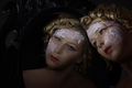
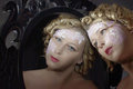
Well, I'm kinda wondering about the result of my SP. I had hoped for a top 20. I put in a lot of effort for this shot, the lighting especially, not to mention the hair & make-up.
I think it got 45th place because it is a really good image and scored really well. No kidding! There were some great images, yours was one of them. I think a 6.2 is an excellent score. The low key approach probably cost you some points, but all in all you should be very proud of the image and the placing in the very competitive challenge.
I think it got 45th place because it is a really good image and scored really well. No kidding! There were some great images, yours was one of them. I think a 6.2 is an excellent score. The low key approach probably cost you some points, but all in all you should be very proud of the image and the placing in the very competitive challenge.
but is it really THAT low-key? the mirror is lit from behind to accentuate it's contours, my face is lit in both the reflection and myself (did that on purpose too by holding the mirror tilted so it would light my face from the other side as well)
I know there are some people who said the face was not light enough. I'd like to recommend calibration for some of them :P
edit: I did burn my jawline a little to hide those sagging cheeks ;-)
Well, I'm kinda wondering about the result of my SP. I had hoped for a top 20. I put in a lot of effort for this shot, the lighting especially, not to mention the hair & make-up.
So why did it end up 45th?
Personally, I think you ought to look at the big picture.....you got 31 comments, and if you look at who some of them are from, you'll realize that you really hit a preferred target audience for meaningful, classic photography. There is not a damn thing wrong with this image whatsoever, and IMNSHO, you should be happy and proud to add it to your portfolio.
I wouldnt say its dark, but looking at it on my non-calibrated monitor here at work I can see what looks like to me areas where burning has been applied in the BG, you can see the brush strokes.. But like I said this monitor isnt calibrated. If I had voted on this challenge I would of probably given it a 6 - so you scored slightly above what I think it is worth. 42nd seems fair to me in this extremely strong challenge.
you put lace on your face. that is strange. strange brings the vote down. the "technicals" that you worked so hard on kept it above 6. If 6.2 isn't high enough for you, there's no way you should be making such artistic choices.
you put lace on your face. that is strange. strange brings the vote down. the "technicals" that you worked so hard on kept it above 6. If 6.2 isn't high enough for you, there's no way you should be making such artistic choices.
but then you will only be making the shot to please voters and disregard your own artistic urges and values. I will never do that :-)
I think it's a nice shot and you have a beautiful face, great makeup and hair... however... the lace - which I love, by the way... - does not seem to gel with the rest of the picture. It seems out of place somehow, maybe because of the darkness I feel from the picture as a whole. I think if it were lighter as a whole (and my screen is calibrated ;)) it would have scored higher, in my opinion.
I think you've done really well, but I can understand your frustrations at not getting a top ten or twenty with this.
I think it's a great shot. You control the lighting very well. Dark does have some trouble on voting because if people have uncalibrated monitors, my guess is they tend to be on the dark side and so detail is lost.
The only thing I might change is actually center the composition a bit more. Not totally, but giving just a bit more breathing space on the right would, in my eyes, improve the picture.
I know there are some people who said the face was not light enough. I'd like to recommend calibration for some of them :P
DON'T use a calibrated monitor for webwork. Because everyone's monitors are UNcalibrated, you need to see what everyone else is seeing. Monitor calibration is for seeing what your PRINT will look like.
And, yes, IMO, the faces need better lighting on my UNcalibrated monitor.
For me the picture just seems off some how not sure if it is the angle of your face or what. Perhaps it would look better if it was portrait instead of landscape. The negative space to the left dosen't seem right either. I also think it appears too dark. Maybe B&W would have served you better with a little bit of diffusion. just shooting random thoughts that pop in my head.
At least you didn't get a 4 something 6 is pretty respectable and if you like it and it is all you hoped it to be and are happy don't change a thing..
I like it! It's a classic golden age Hollywood type portrait. Love the eyes 8) The shot works very well in color.
I would say it is rather Low Key, even with the lace. Nothing bad about it really, I actually enjoy a great Low Key shot. From my experience, Low Key or High Key shots can be trickier because it may look different on many different monitors that aren't calibrated for shadows/highlights. Which is actually simple to do //www.photofriday.com/calibrate.php. Yeah, and the difference between LCD and CRT ;) The more people tweak their screen, the better. And not as complicated as color calibration. Looking at the score, looks like many people saw it correctly.
As for a few things I think might have helped the score. Selective Noise reduction, on the smooth areas of the shot, and not on the hair. The mirror, if had a few more highlights to make it stand out. It may be mistaken for a blotchy background on some people's screens but looks quite good here, except for the part near the middle left edge of the frame. Edit: I take that back. Looks good. The perspective makes it a bit tricky seeing it as it is.
For me the picture just seems off some how not sure if it is the angle of your face or what. Perhaps it would look better if it was portrait instead of landscape. The negative space to the left dosen't seem right either. I also think it appears too dark. Maybe B&W would have served you better with a little bit of diffusion.
I agree totally *thumbs up*
In fact, I'd love to see this shot in B&W.... very 'Old Hollywood'....
Probably it suffered from "poor voter monitor callibration syndrome" as many darker images do. Have you looked at it on other monitors? Apple vs Pc? the processing looks drab on mine. how about submittibg it to the PPChallenge to see what others would do with post process and cropping. you are correct that it should be/could be a stunning image.
ps. perhaps all that unidentified bright stuff in the dark left side is distracting? i have one of those brains that likes to know what i am looking at - if i cant identify it, it confuses me- now that the challenge is over, you cab crop or edit it out
ooh - in bears version, i see it is a mirror frame - so sorry but that was completely invisible to me.
On my monitor it is quite dark, with not a heck of a lot of separation down in the neckline area and with the details of the mirror looking like brush flaws from burning in on the upper left. I downloaded the image and applied a LOT of levels adjustment to it and came up with the following:
Now, this may be too light, I'd probably go somewhere in between, but it looks a heck of a lot more interesting on my monitor. I think a lot of it is the difference between CRT and LCD monitors. On my neighbor's monitor (LCD) the details are quite a bit more visible.
On my monitor it is quite dark, with not a heck of a lot of separation down in the neckline area and with the details of the mirror looking like brush flaws from burning in on the upper left. I downloaded the image and applied a LOT of levels adjustment to it and came up with the following:
Now, this may be too light, I'd probably go somewhere in between, but it looks a heck of a lot more interesting on my monitor. I think a lot of it is the difference between CRT and LCD monitors. On my neighbor's monitor (LCD) the details are quite a bit more visible.
On my monitor it is quite dark, with not a heck of a lot of separation down in the neckline area and with the details of the mirror looking like brush flaws from burning in on the upper left. I downloaded the image and applied a LOT of levels adjustment to it and came up with the following:
Now, this may be too light, I'd probably go somewhere in between, but it looks a heck of a lot more interesting on my monitor. I think a lot of it is the difference between CRT and LCD monitors. On my neighbor's monitor (LCD) the details are quite a bit more visible.
R.
I do like what you've done, Robert. But it lost some of the mystery to the shot. Don't like the kneck area that bright though, the angle makes it seem more odd, more emphasis should go on the face I think.
Haha, I have a calibrated monitor, although it is a LCD on the laptop and it tends to be somewhat dark. That being said, in Puckzzz original, I had no idea there was a frame around the mirror. Just goes to show you the risk of a low-key shot.
Maybe if the reflection was a bit brighter itself?
[thumb]624232[/thumb]
or
just keep the main profile as the focus point. Mainly the eyes on both sides.
[thumb]624238[/thumb]
And one in B/W
[thumb]624231[/thumb]
Still like the color for the pretty blue eyes and blonde curls.
Will remove the links on command ;) (Please PM me if you wish)
On my monitor it is quite dark, with not a heck of a lot of separation down in the neckline area and with the details of the mirror looking like brush flaws from burning in on the upper left. I downloaded the image and applied a LOT of levels adjustment to it and came up with the following:
Now, this may be too light, I'd probably go somewhere in between, but it looks a heck of a lot more interesting on my monitor. I think a lot of it is the difference between CRT and LCD monitors. On my neighbor's monitor (LCD) the details are quite a bit more visible.
R.
I do like what you've done, Robert. But it lost some of the mystery to the shot. Don't like the kneck area that bright though, the angle makes it seem more odd, more emphasis should go on the face I think.
Yeah for sure; that was just a global levels adjustment to show what's "missing" in the image as entered, at least on my monitor. I'd do quite a bit more local-area adjustment if I were actually doing the post on this myself.
Haha, I have a calibrated monitor, although it is a LCD on the laptop and it tends to be somewhat dark. That being said, in Puckzzz original, I had no idea there was a frame around the mirror. Just goes to show you the risk of a low-key shot.