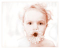
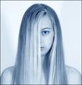
OK, I'm friends with both these guys so I'm not looking to pick a fight here or anything. I do think it's interesting to note the score difference between timfy and scarbrd's shots which are similar in subject and processing.
The baby shot is so elegant it looks like if you stare at it too long it will shatter. The other shot is nice, but the blue tones make me think of body on a tray in the mourge to be honest, and the super blue eye has a very jarring effect.
I gave Timfy's a 9 for it's processing and cuteness but it certainly wasn't anonymous like the other entries!
I felt scarbrd's lacked something still cant be sure but I think it might be the lack of a spark of emotion from the model.
Ok now back to comment more seriously. I have a theory and I am curious what everyone thinks. I think the major difference is the difference between thumbnail and image that shows for voting. Some folks don't go straight through voting and rather pick and choose in sections. Timfy's looks pretty good in thumbnail as does scarbrd's but the dramatic difference from thumbnail to voting view in Timfy's is simply staggering. The drastic eye flash in Timfy's is almost invisible in thumbnail and then you open up the photo and BAM totally different image and the WOW factor from thumbnail to voting image takes over. BTW I think both are amazing shots well done each.
With all due respect, the eyes of Tim's girl are a real standout. The other girl looks slightly stiff. I think the image deserved far better than 5.85 though...
Scarbrd could have "Pimped" the eyes some. but I think Flower Chick just has more impact visually. The crop is more dynamic and the flower adds "not just a portrait" interest.
timfy entry is another repeated idea, that already has scored well before. It is tested idea and many people while voting must have recognised this thing. Probably this also adds to its high score.
For me this is an entry that shows lack of creativity on photog's part. I would have taken 1 or 2 points out for this thing.
I would have to say that the tone used was a factor in the voting for me. With the flower girl, a warmer more inviting tone was used compared to the blue tone used by scarbrd that usually doesn't flatter human skin much.
I'm probably in the minority in regards to the eyes but I didn't like them in either shot. What separated the two shots for me was polish/completeness and artistic flair. In Tim's shot we've got an interesting background with some subtle detail to it. The model's hair has a sense of motion to it and just looks so soft. Tim also used a prop in his shot which gives a sense of professionalism.
David's shot uses a very bland background which makes it feel almost snapshot-ish. I do like the lines in the shot but I wish there was more of a dynamic quality to it. Perhaps a different composition would have been better than the centered one he used. Lastly, the color. I think that blue is hard to pull off especially when your tones are mostly on the highlight part in the spectrum. I think I would have liked to have seen some darker tones in this shot. Not only do I think it would have given it more of a mood but a darker background matched up with the bright face would have made that eye pop even more and do so more naturally, I think.
How do they decide who goes where in the case of a tie such as 7th and 8th in this challenge.
if it was a tie, and the image was in the top 3, we would see 4 images on the front page. Happened before..
for 7th and 8th, I think that it is a image number or something like that...
They didn't get the same number of votes (one got 162 votes, the other 169) so my guess is they didn't get exactly the same score, just two marginally different scores that come to 6.8580 when rounded to 4 decimal places.
Both are very nice shots, but comparatively speaking:
1. Tim's shot is full of life, scarbird's is much more "sterile"
2. Tim's BG is an active component in the metaphor of the image, scarbird's is neutral
3. The relationship of the model to the BG in Tim's shot (especially how model's right shoulder is fading in to the BG) is much more interesting than in scarbird's shot, where there IS no relationship between the two
4. Tim's is a true high-key image, very skilfully created/processed, and this impresses voters
5. The prop and the catchlights in Tim's shot are added elements that contribute complexity to the image
I'm not surprised to see a full point's difference between them in score.